Projects with direction, attention
to detail and creative training:
the method behind each of my designs
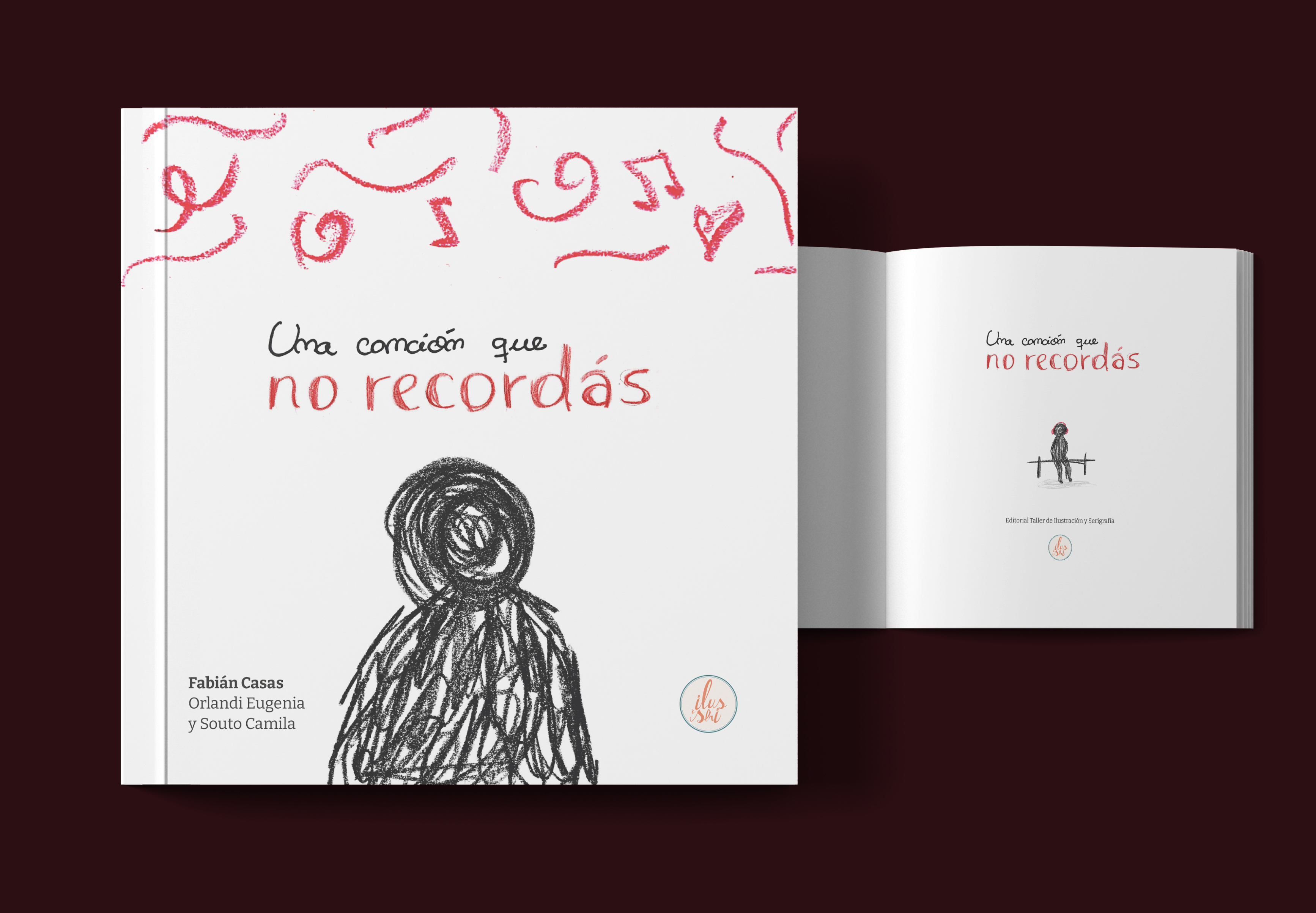
MORE PROJECTS IN
My Behance profile features more
systems that I built with colleagues,
as well as academic projects.





A creative space, where ideas are tested, techniques are developed, and every project becomes an opportunity to improve.
Giving them the clarity and confidence to
express themselves at their best.
Posters, postcards, and illustrations are part of my creative practice, my way of training my eye, exploring new ideas, and continuously refining my craft.
What began as a stationery and design venture in 2018 has now become my creative space as a graphic designer and creative director.
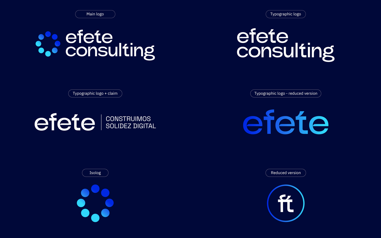
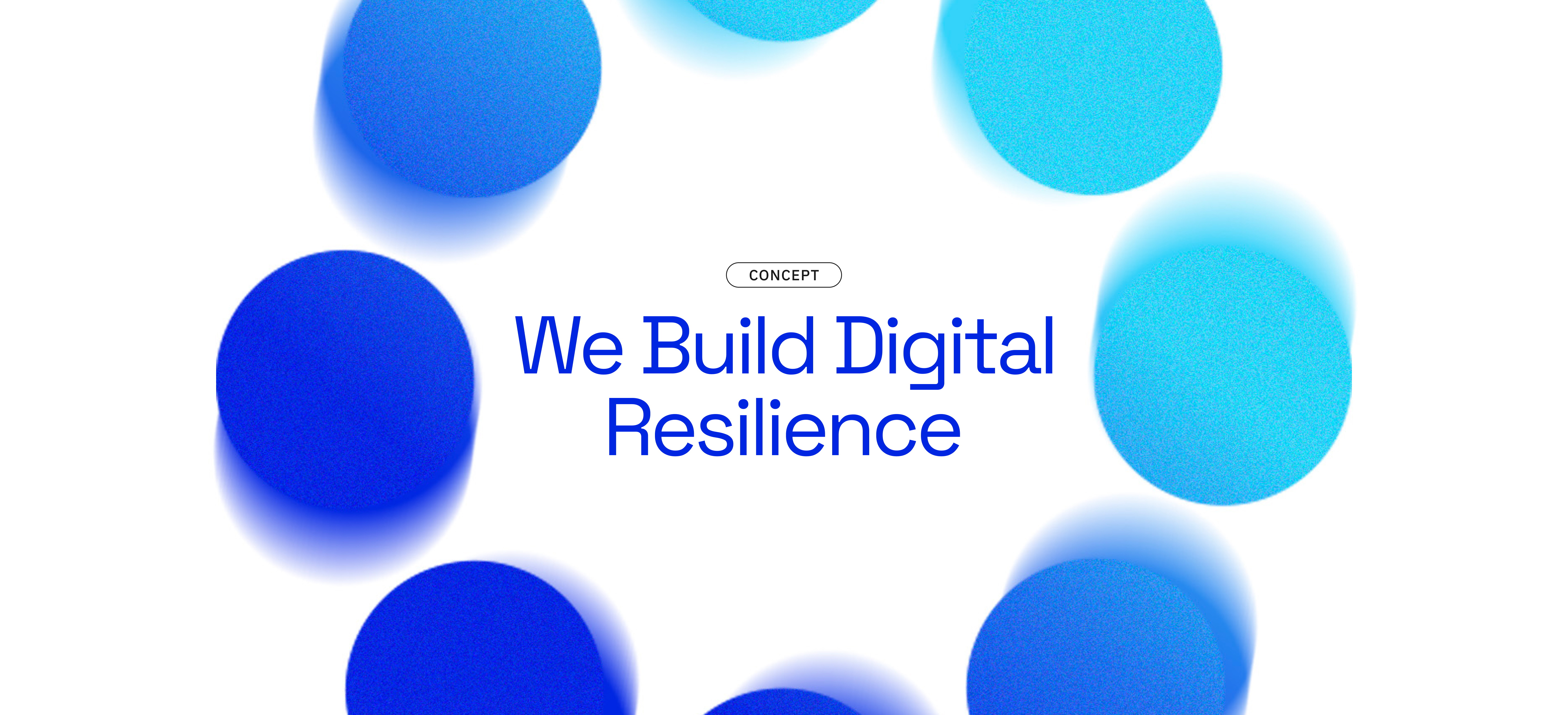
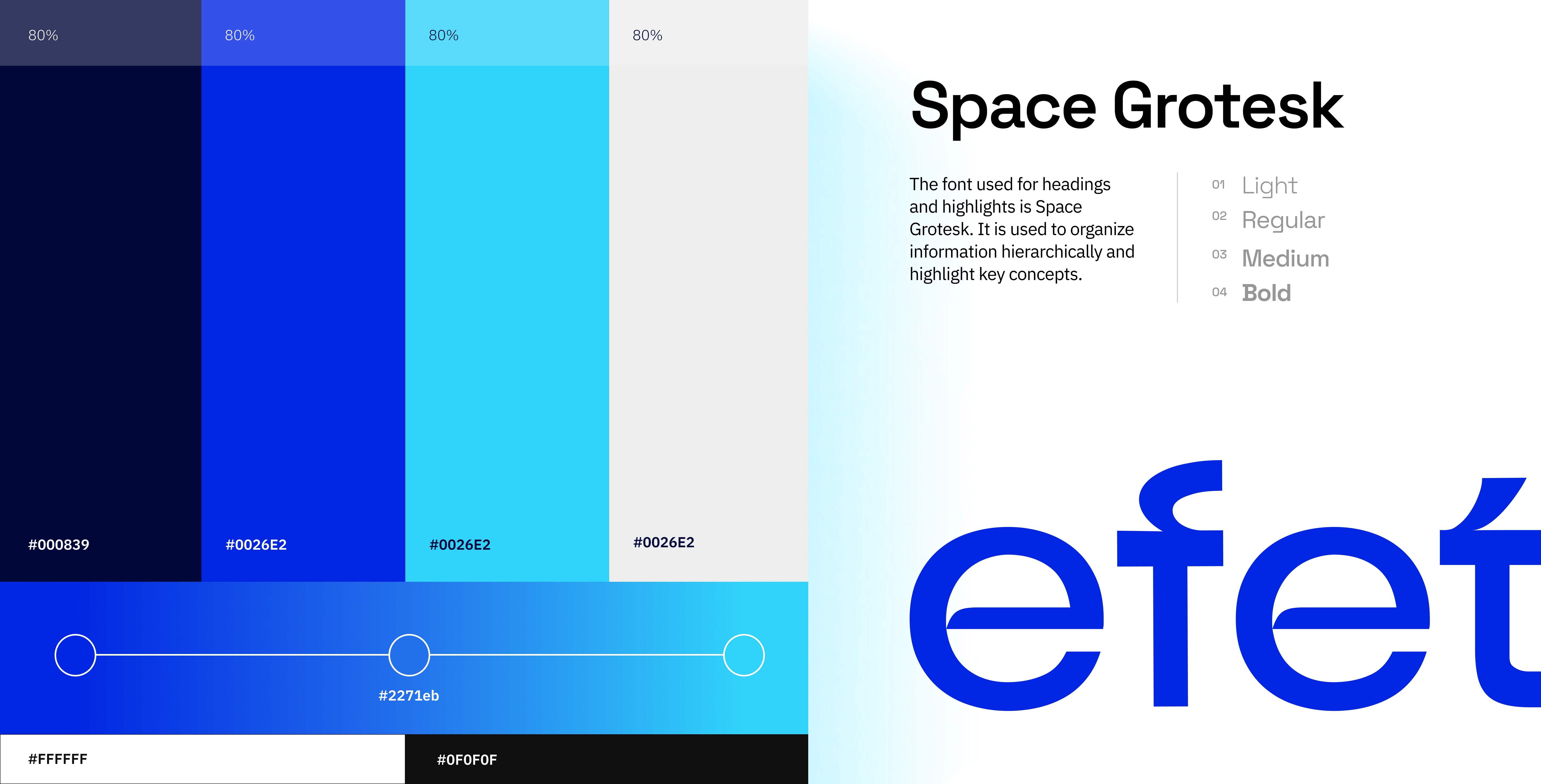
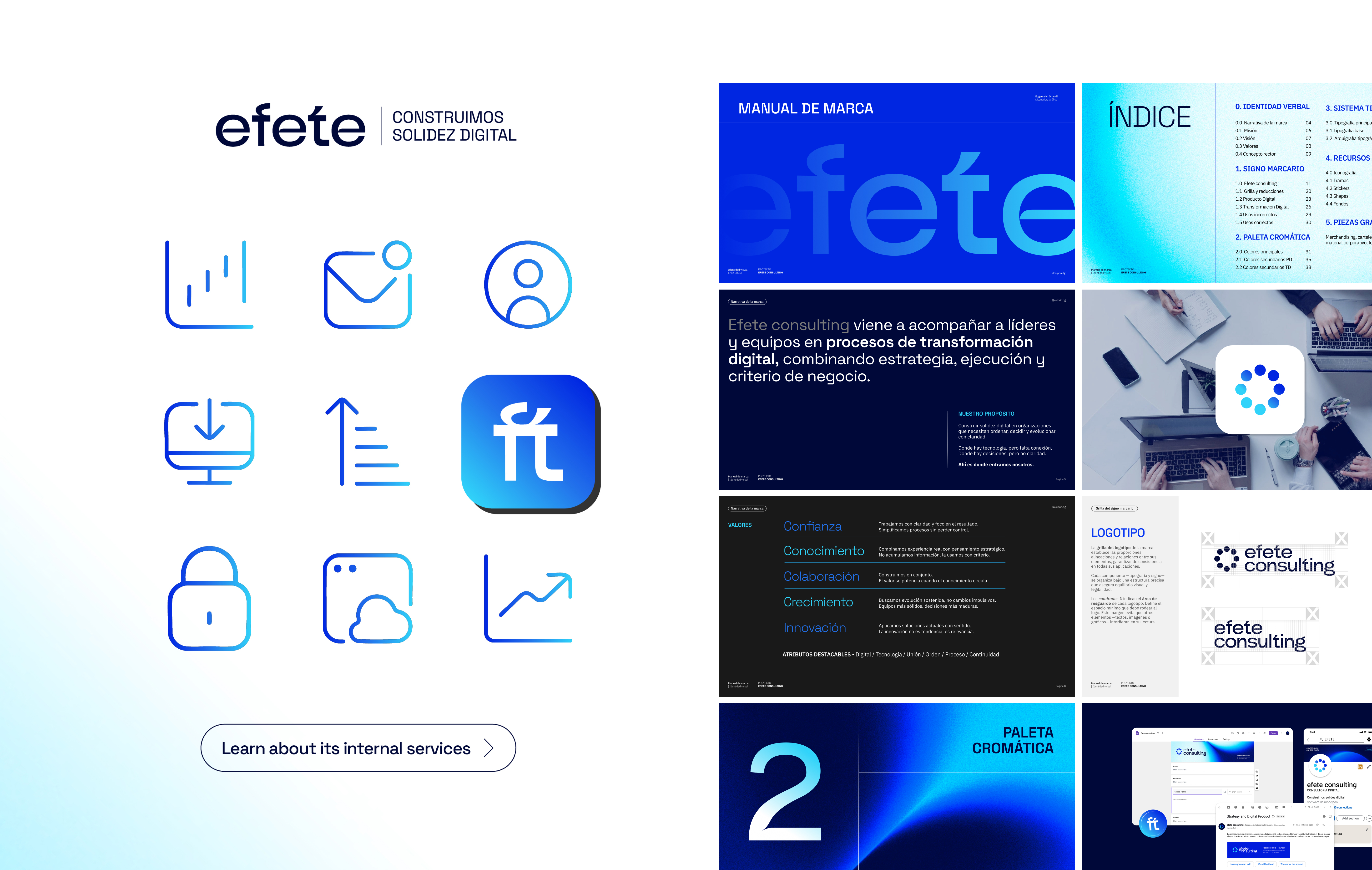
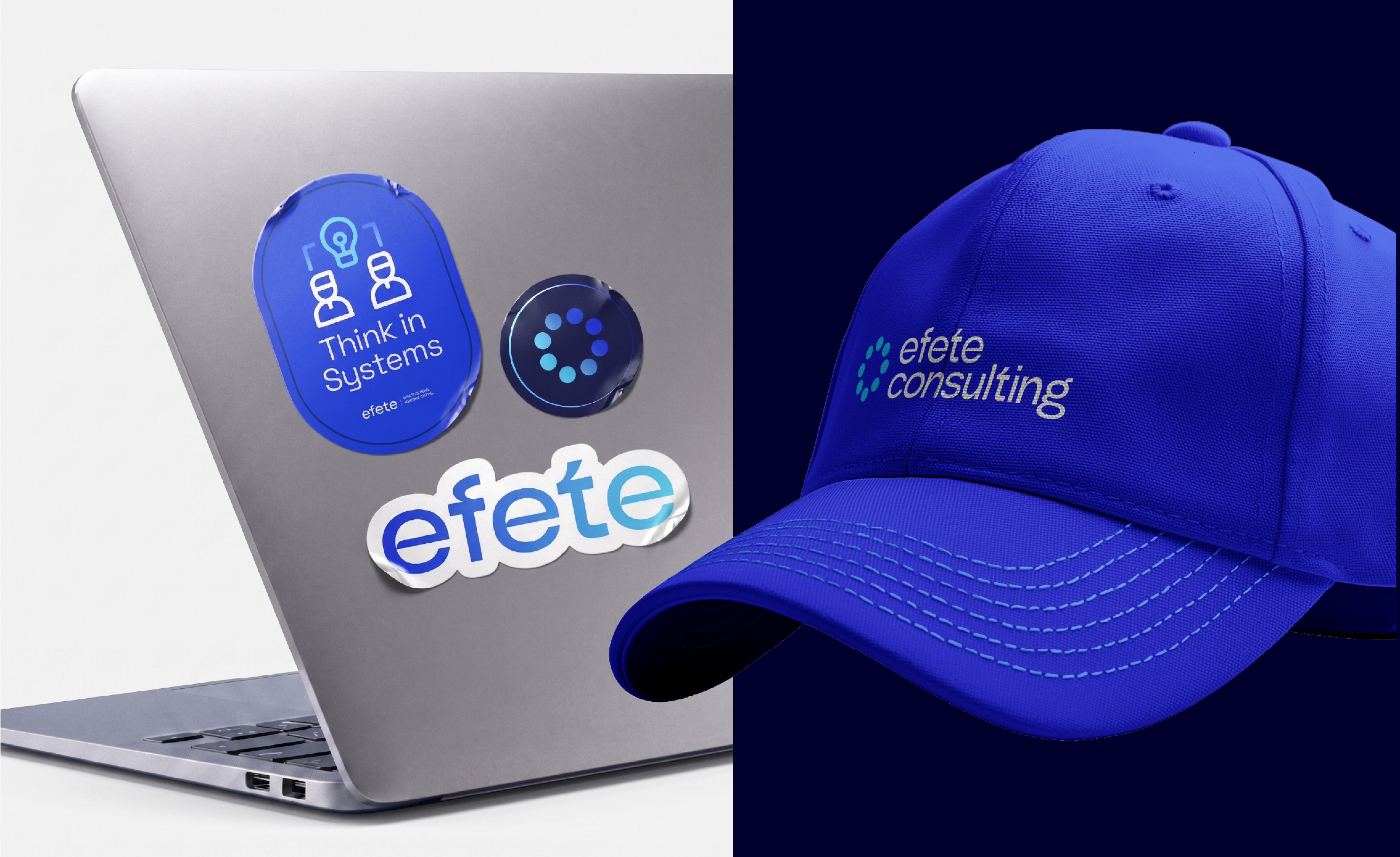
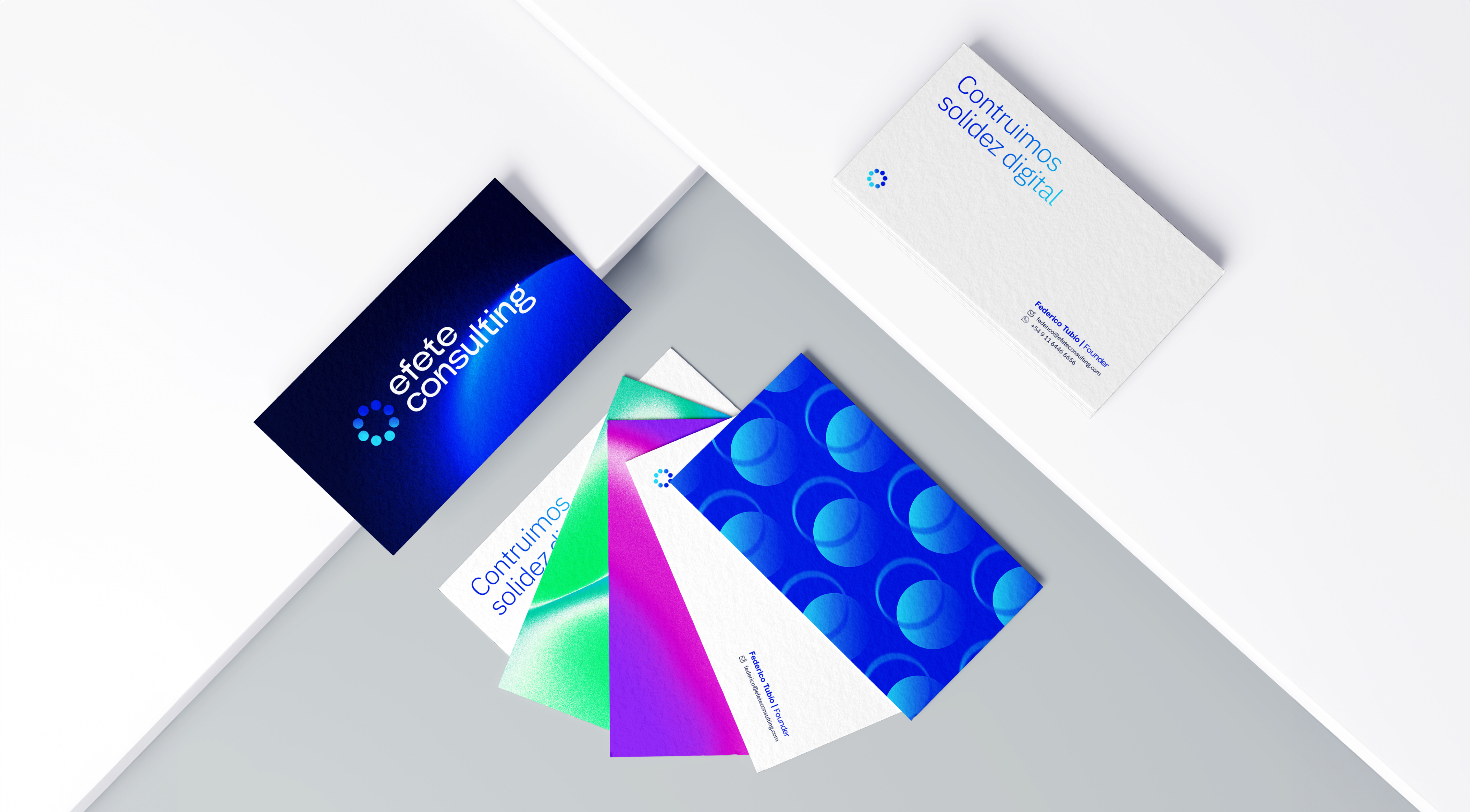
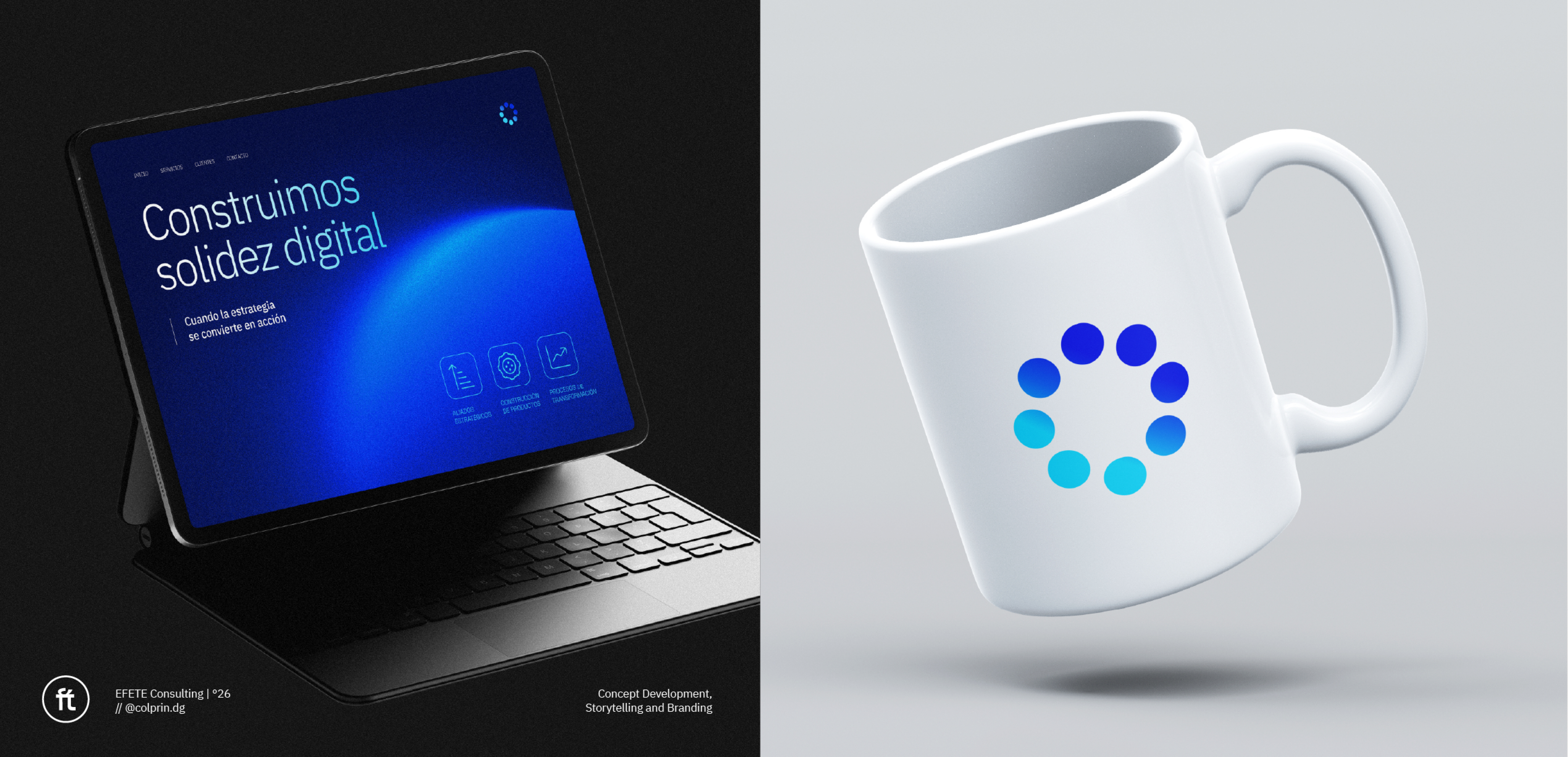
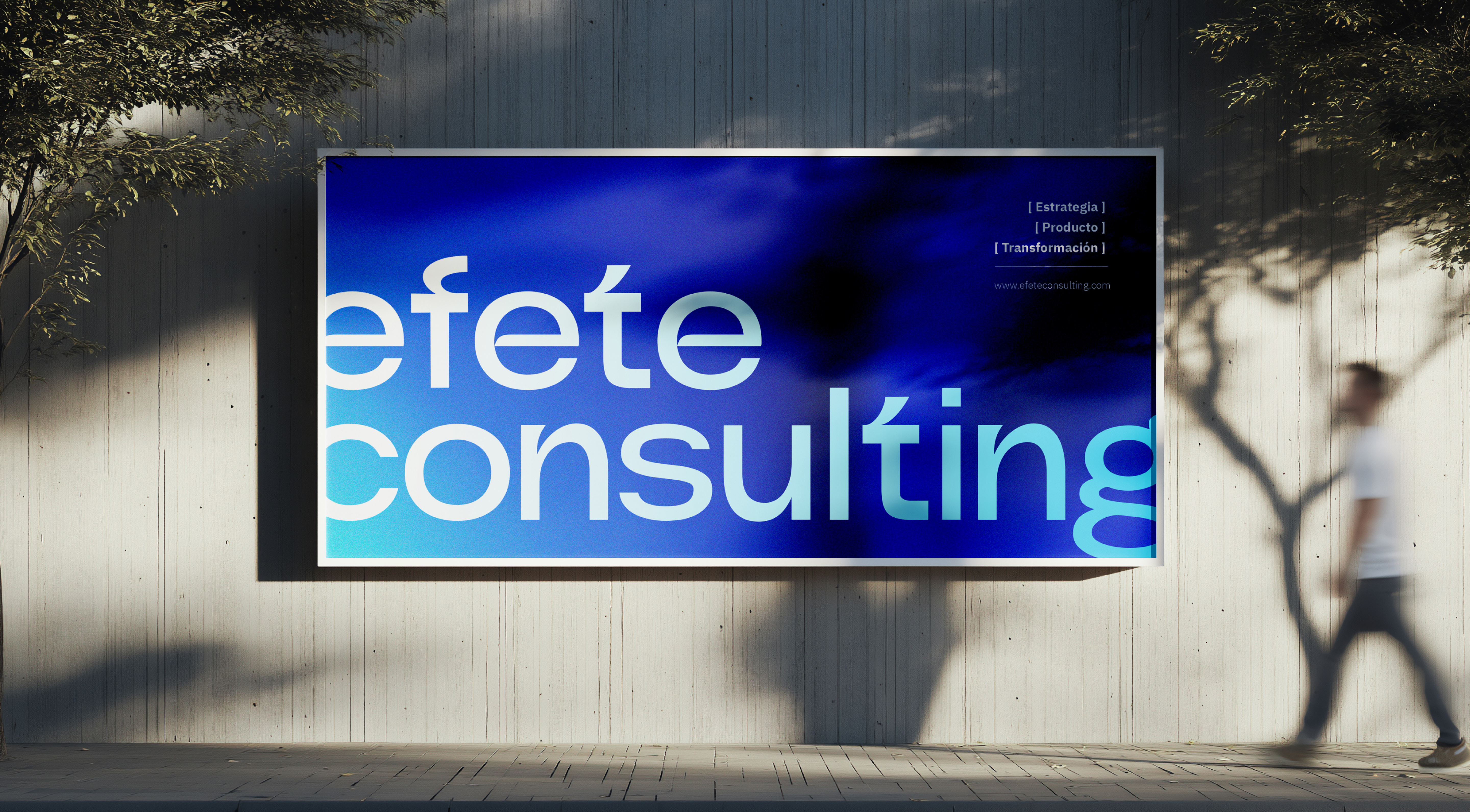
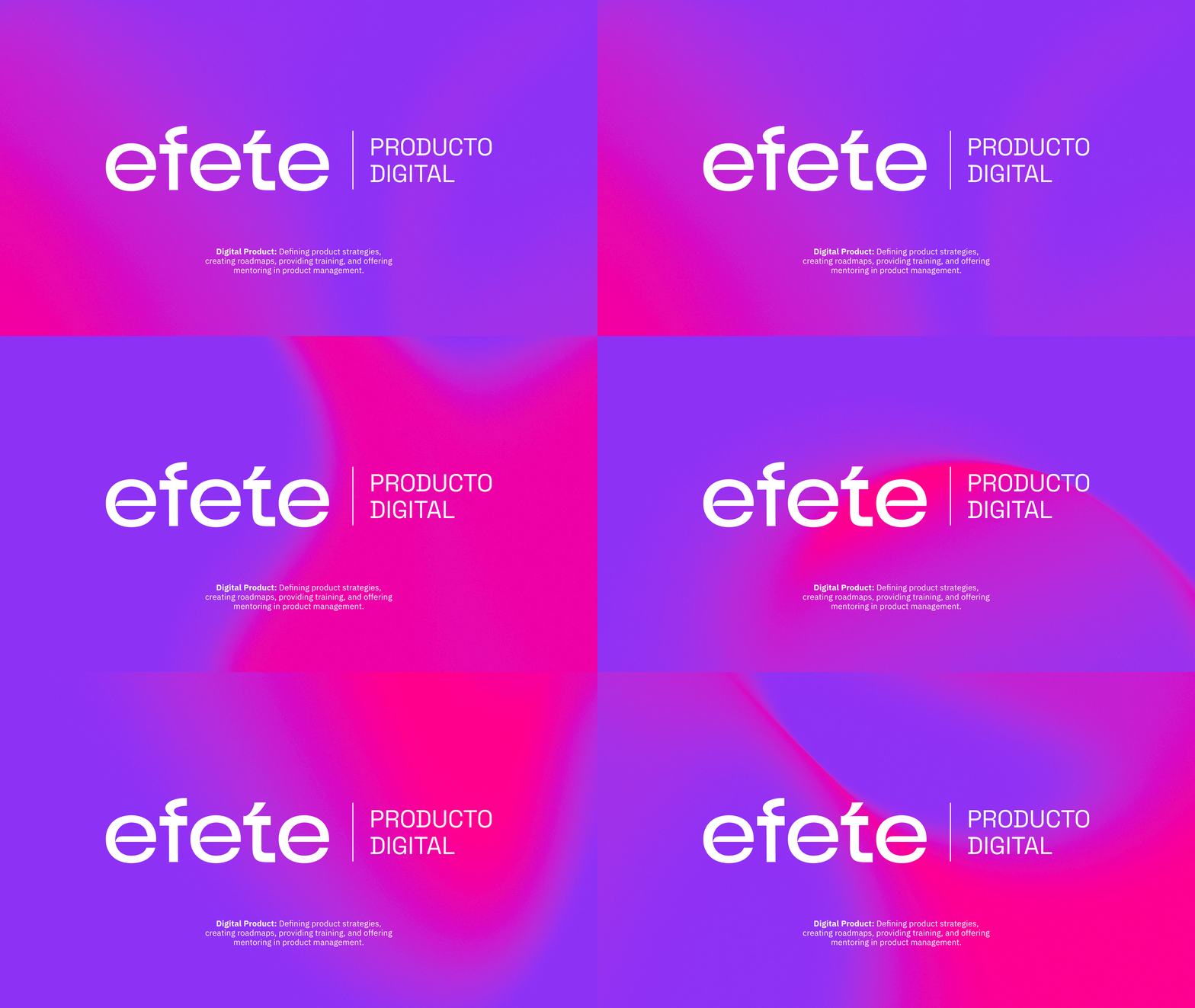
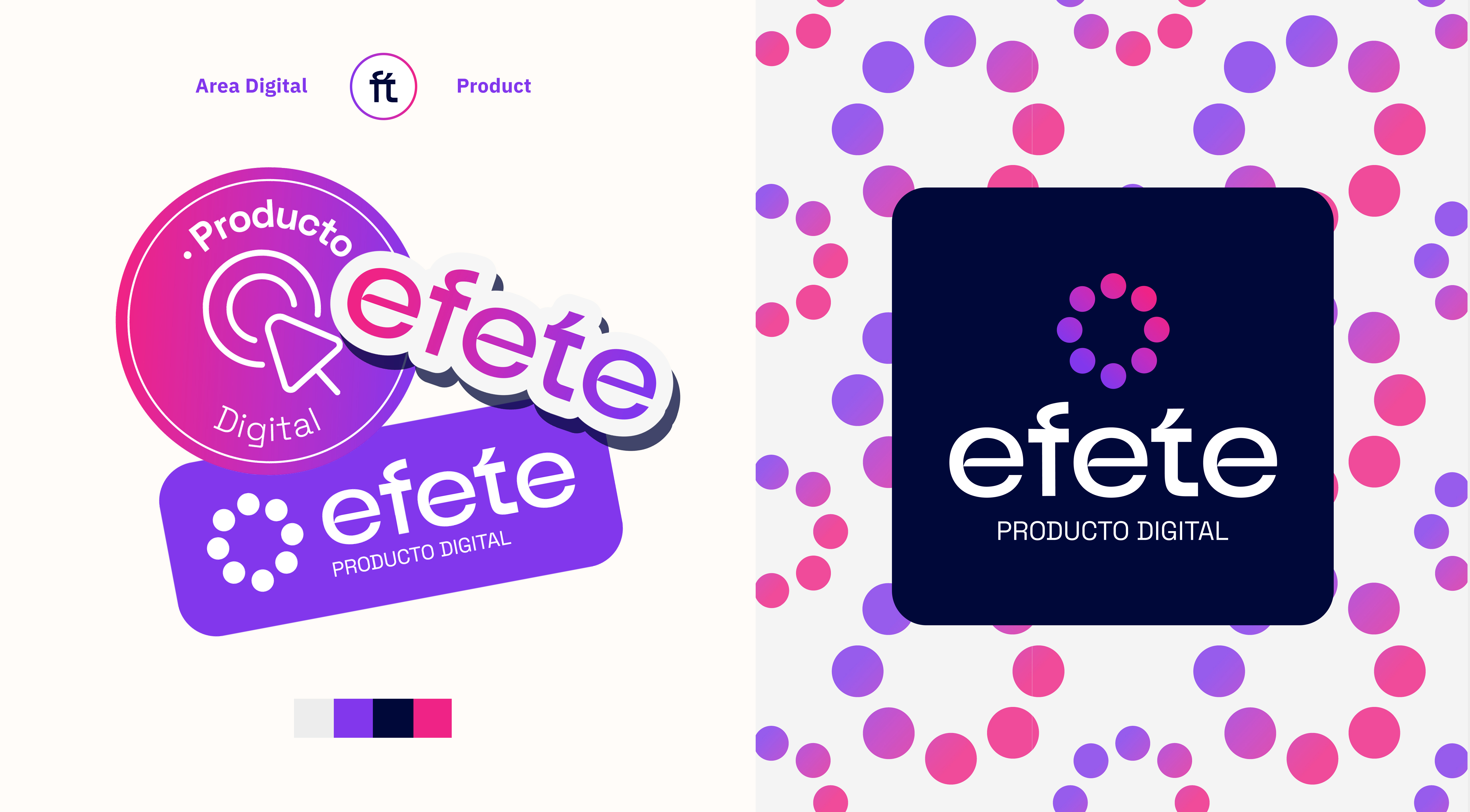
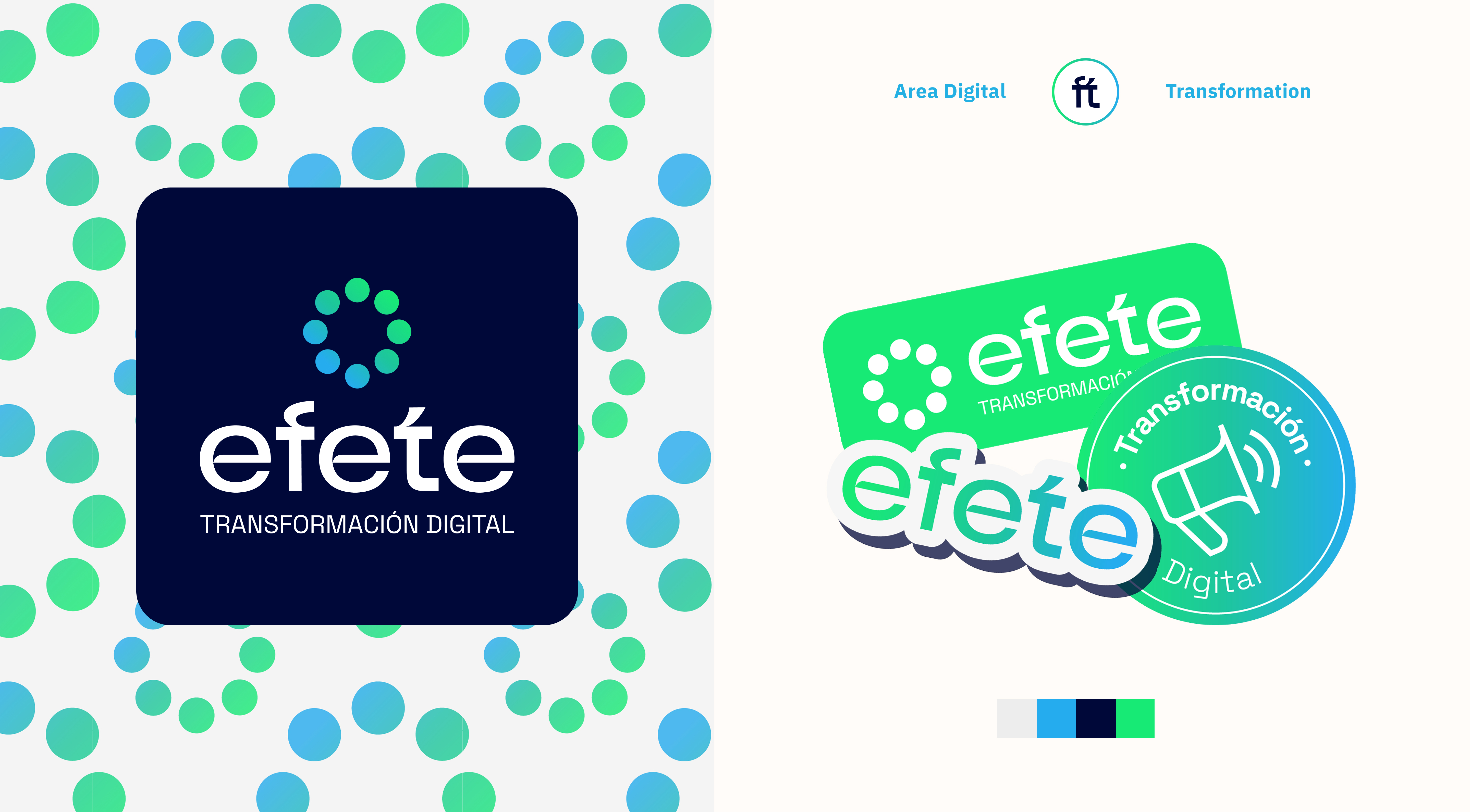
EFETE Consulting is a digital consulting firm that doesn't wing it, but rather builds digital ecosystems based on a strategic foundation. The isotype stems
from that same idea: a collective construction, multiple circles that
form a larger one.



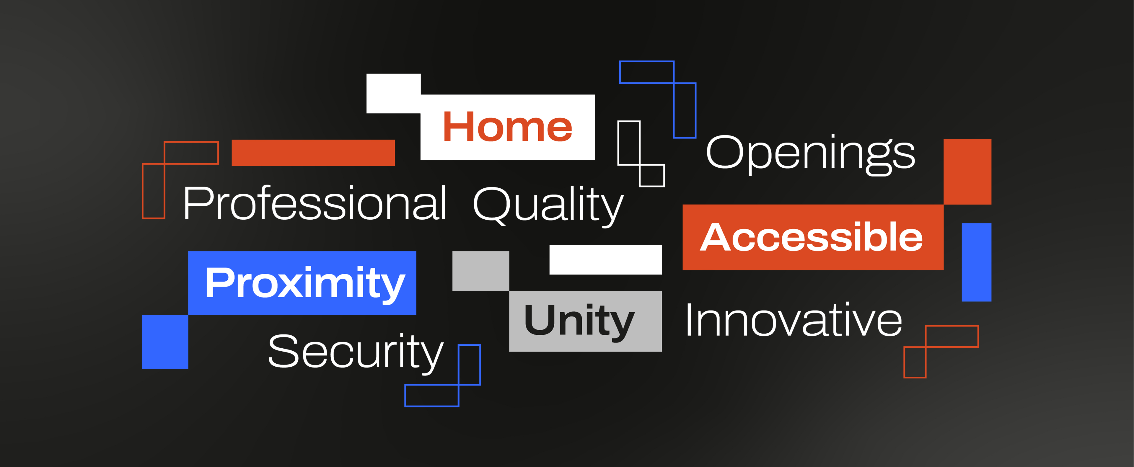
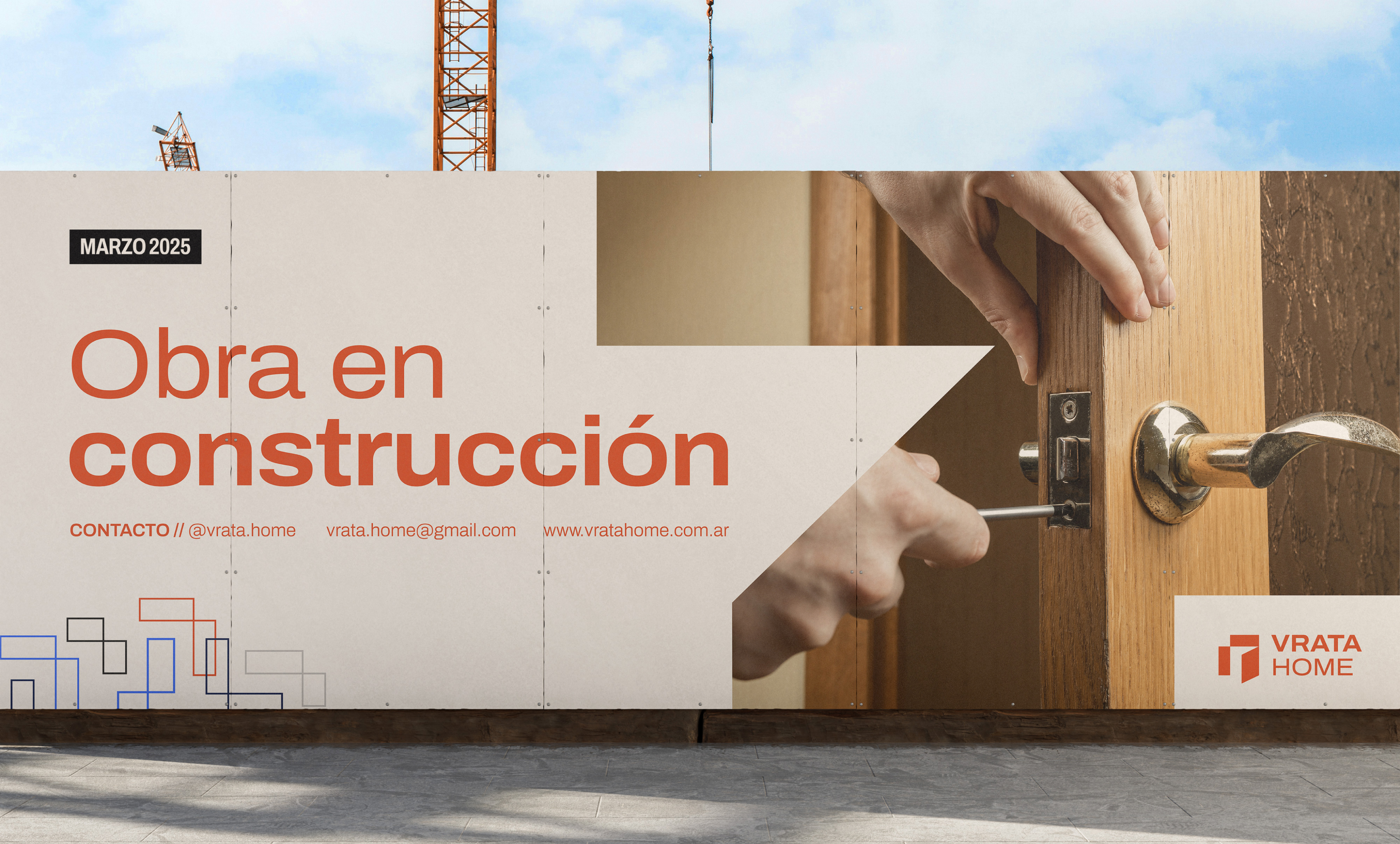
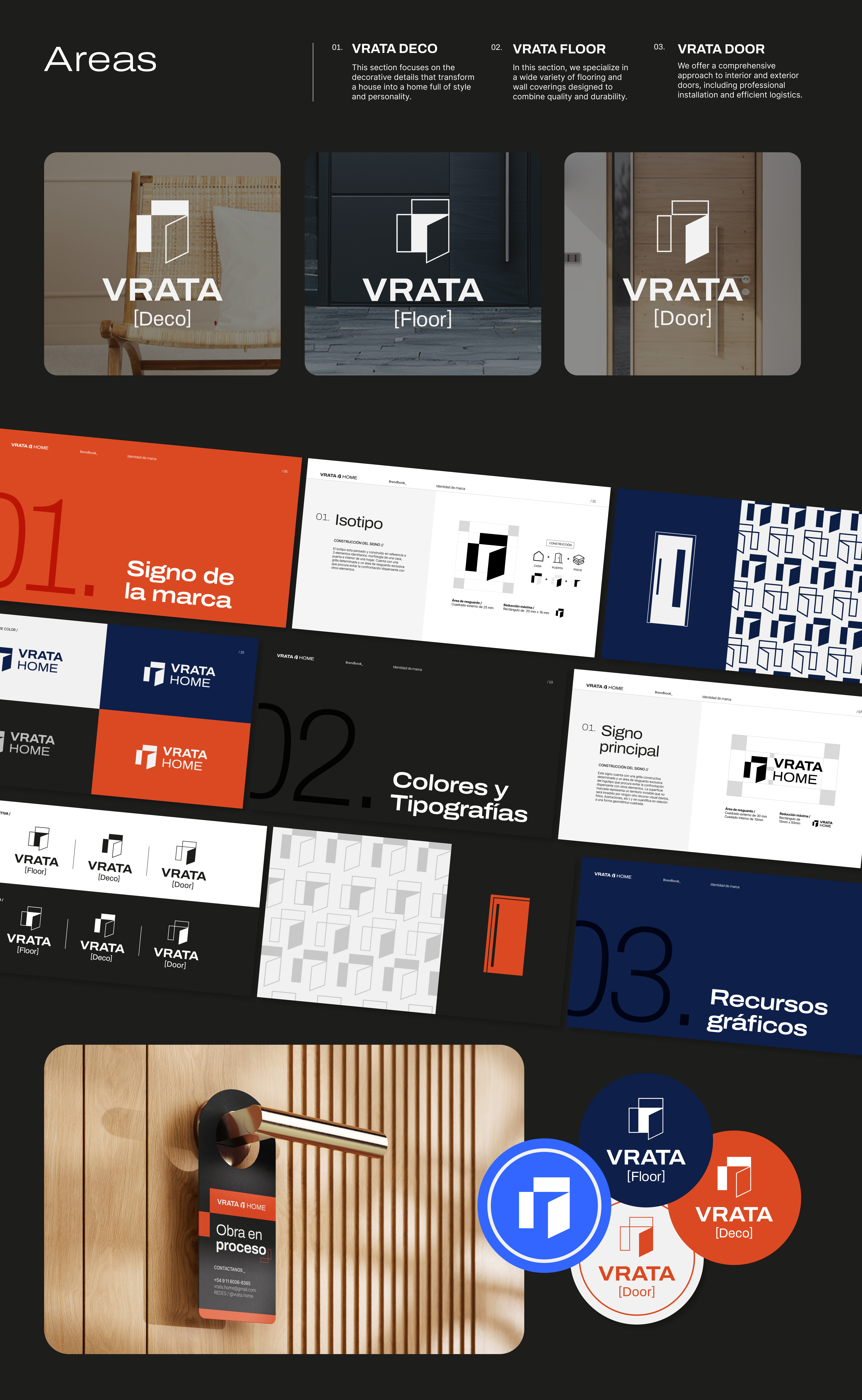
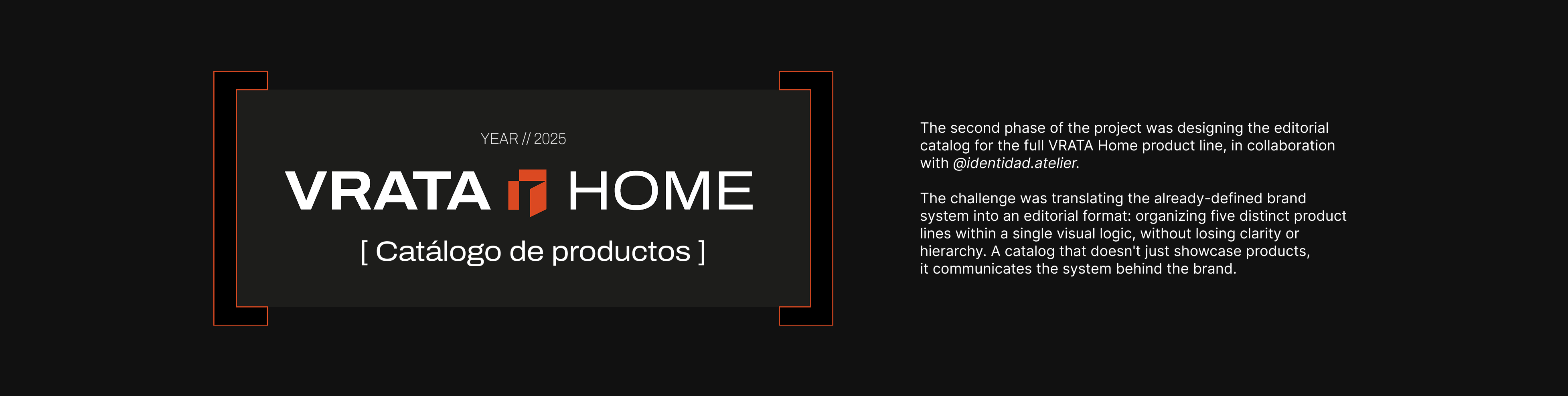
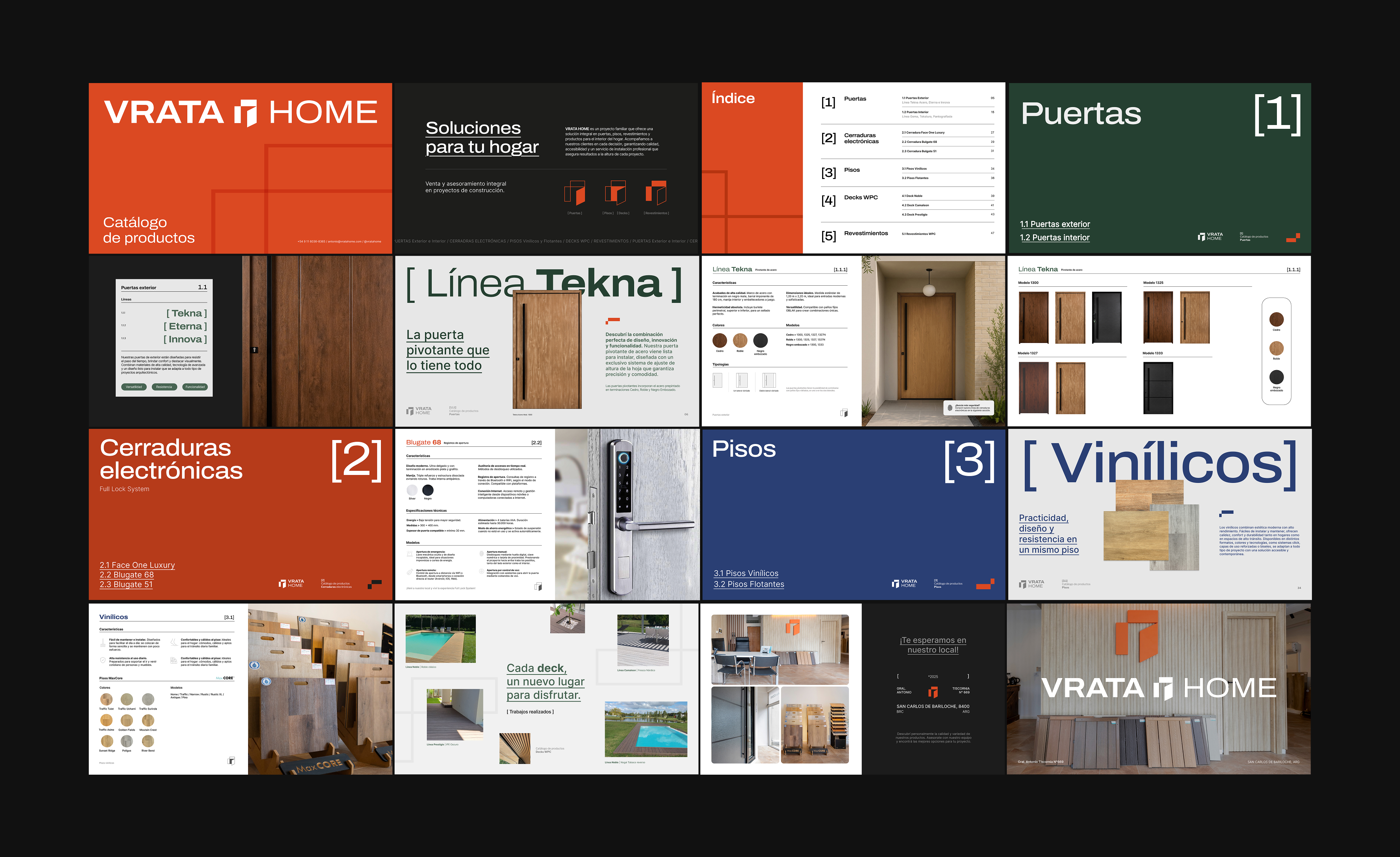
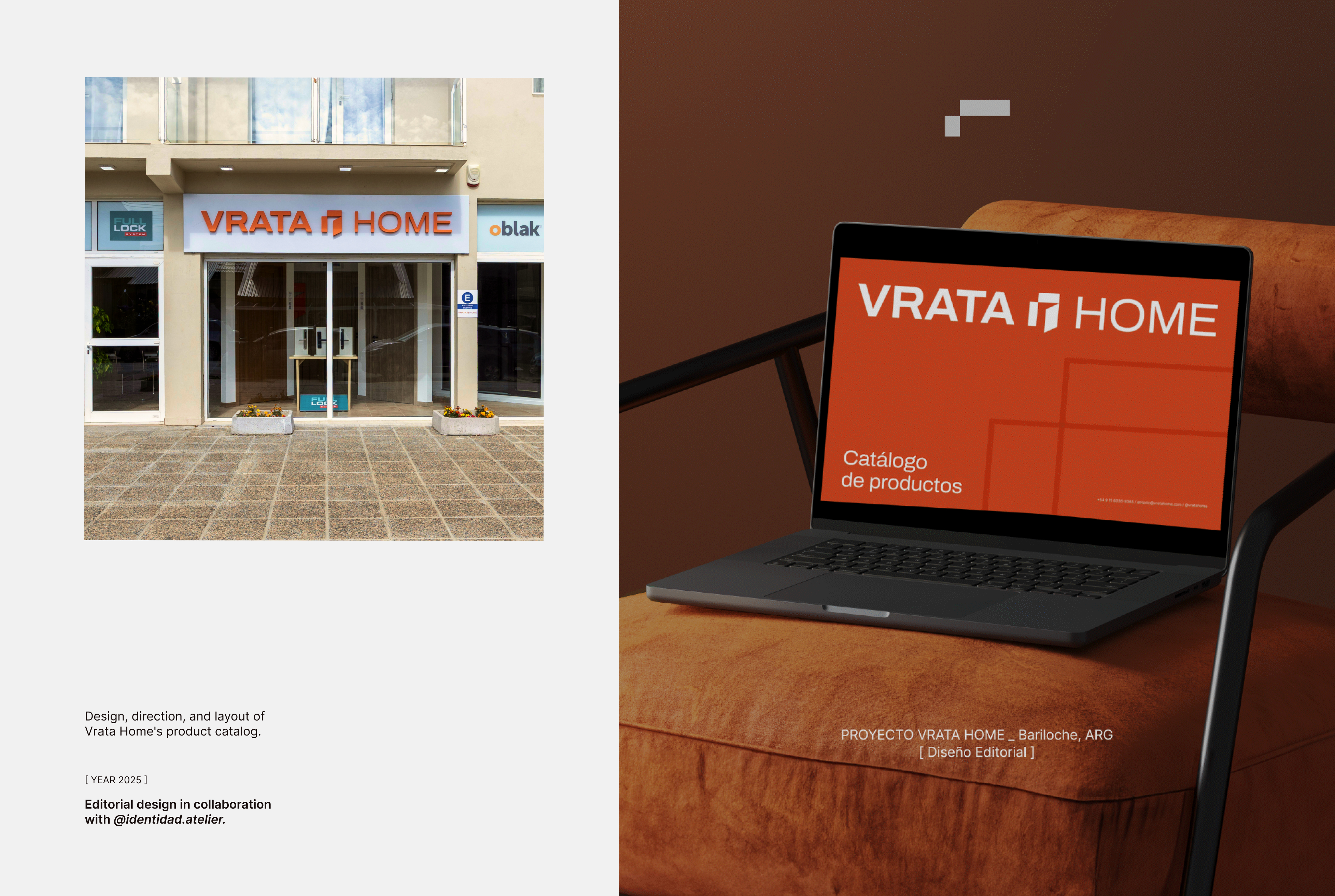
VRATA Home is a family business specialized in doors, floors and coverings.
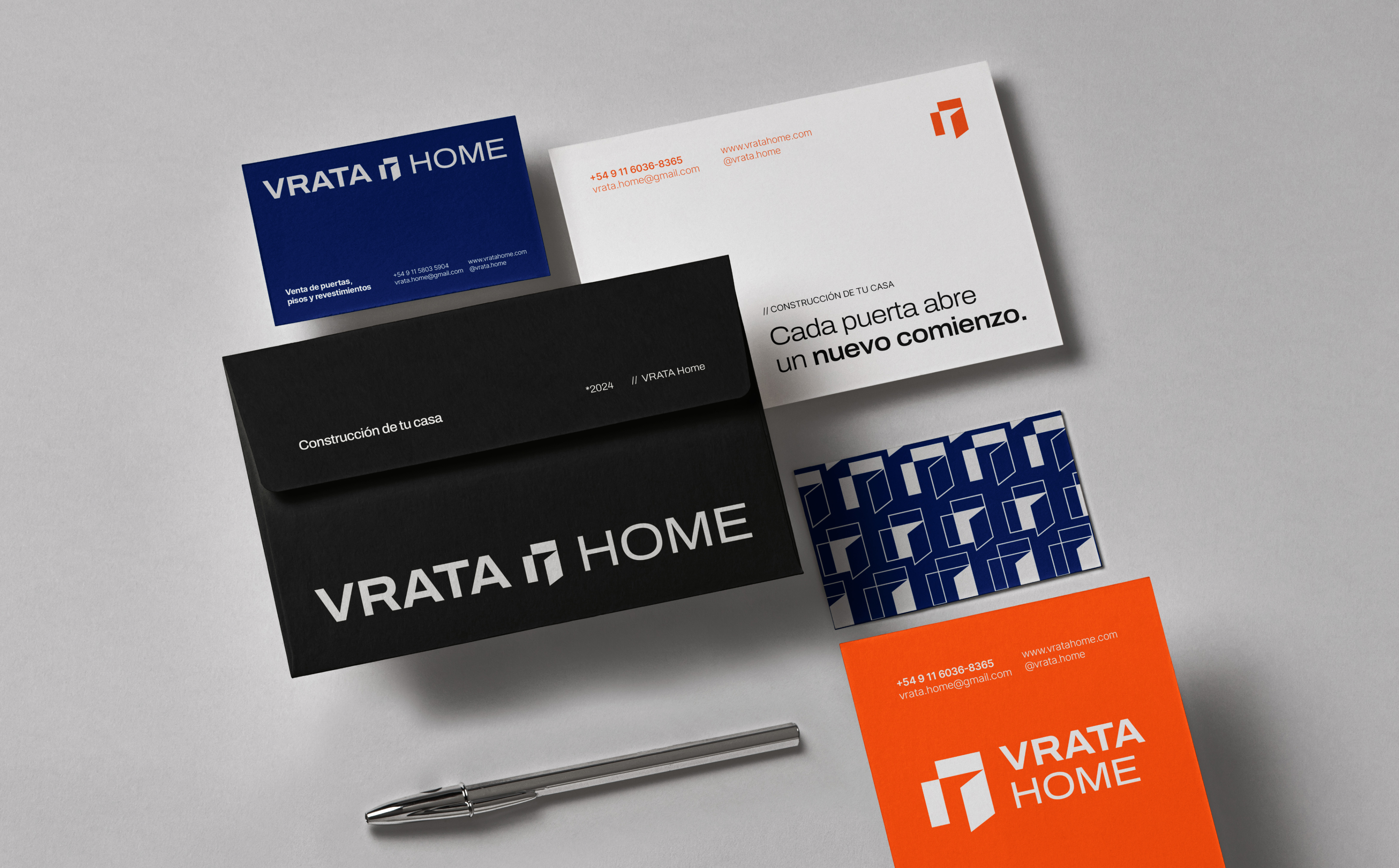
The name plays with the Slovenian word "vrata" (door): swapping the V for a B turns it into "brata" (brothers), who gave rise to the business. The challenge was to build an identity from scratch able to unify three distinct business areas under a single brand system.
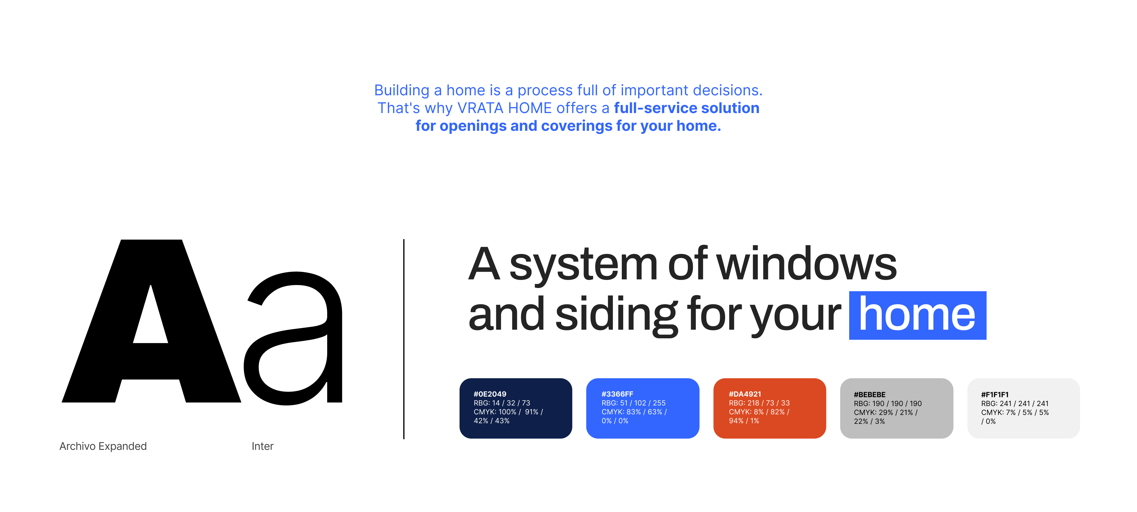
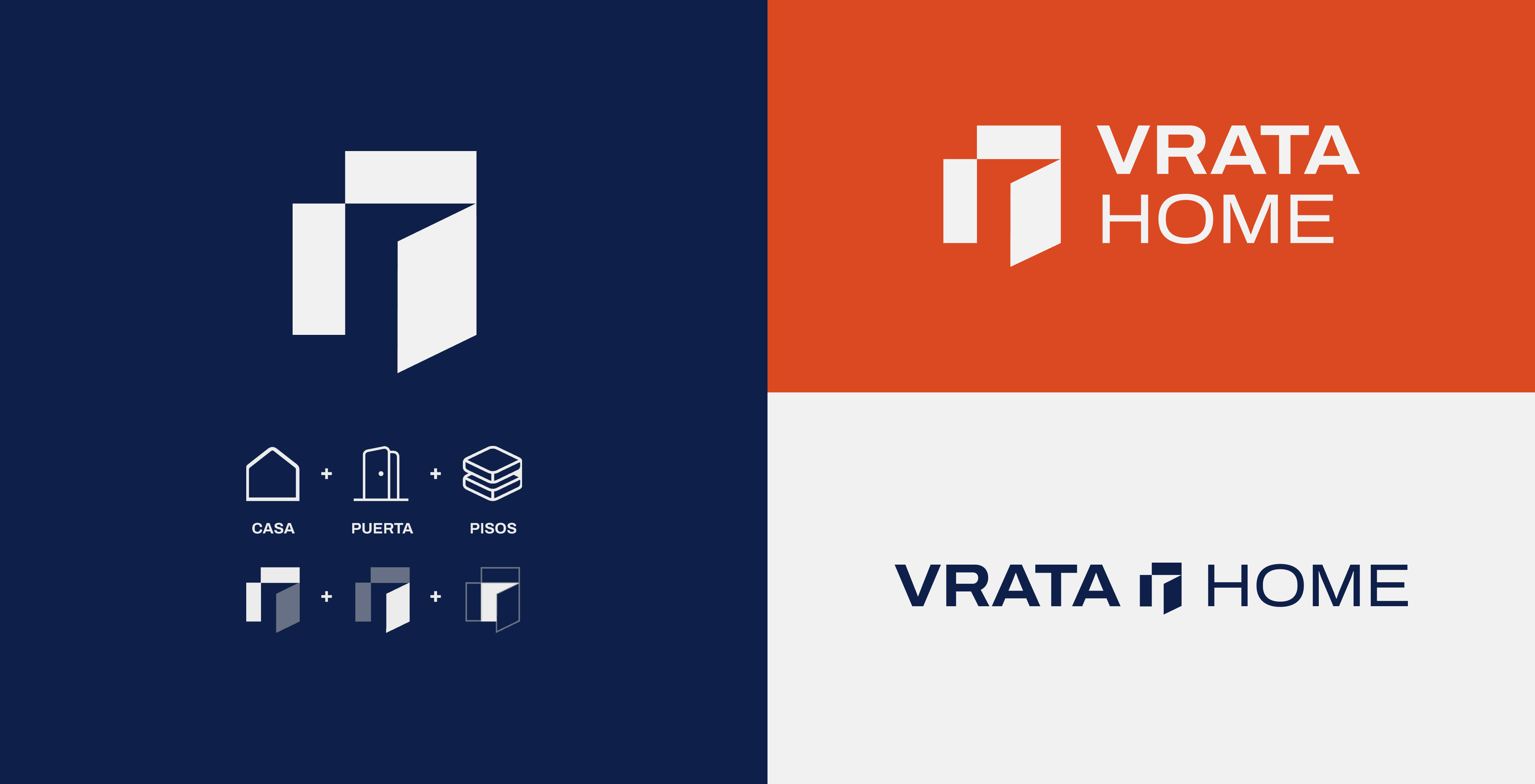
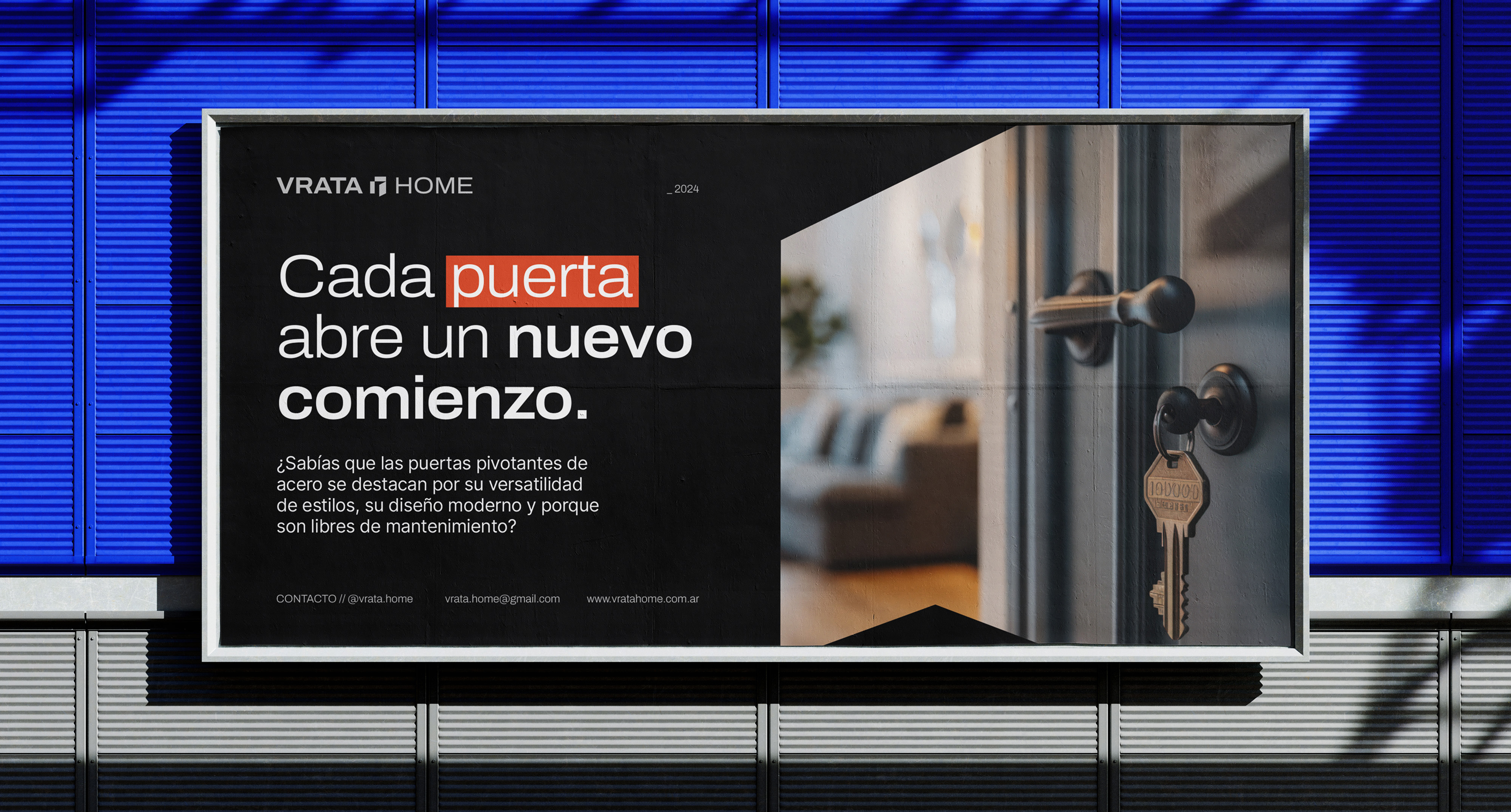
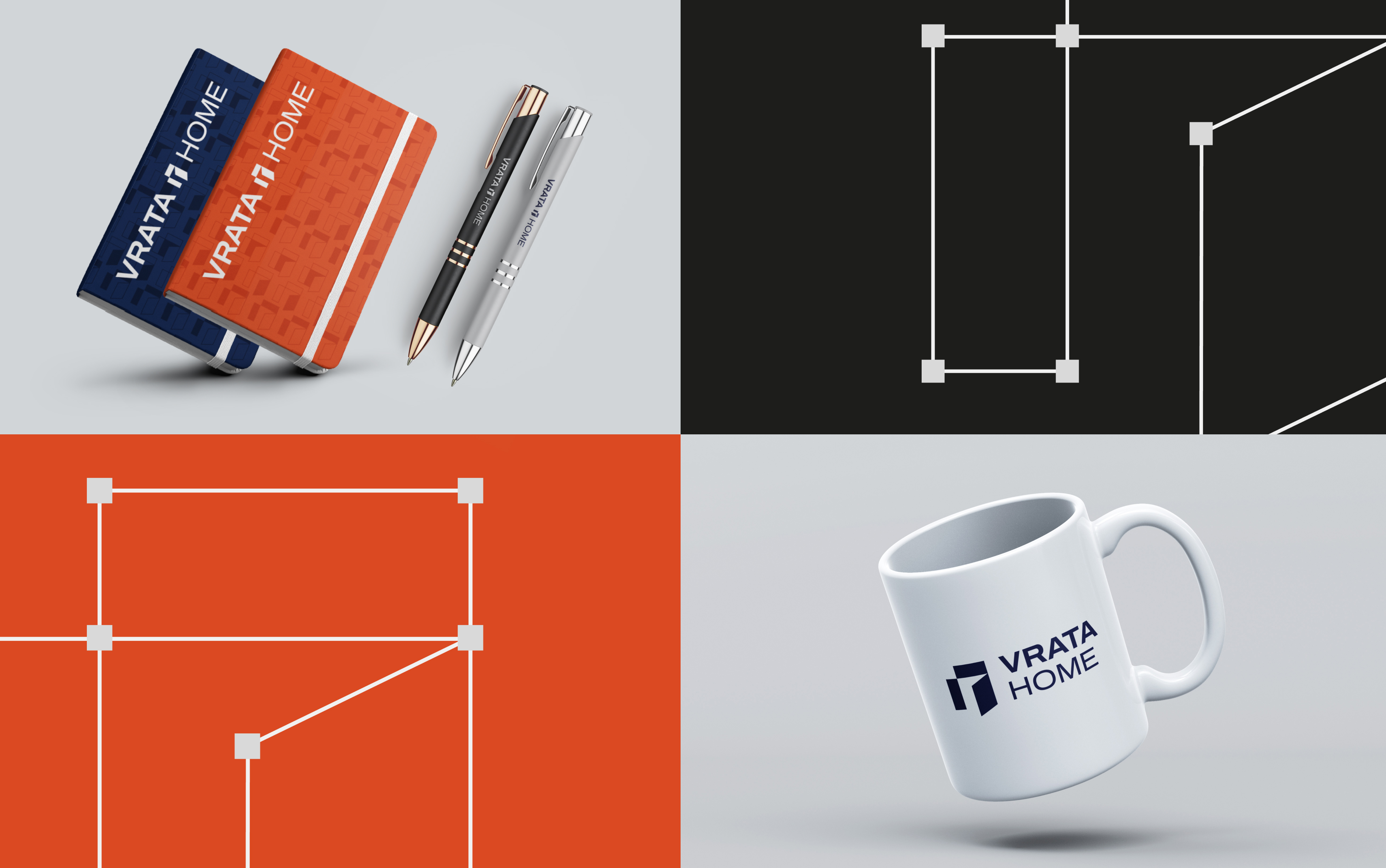



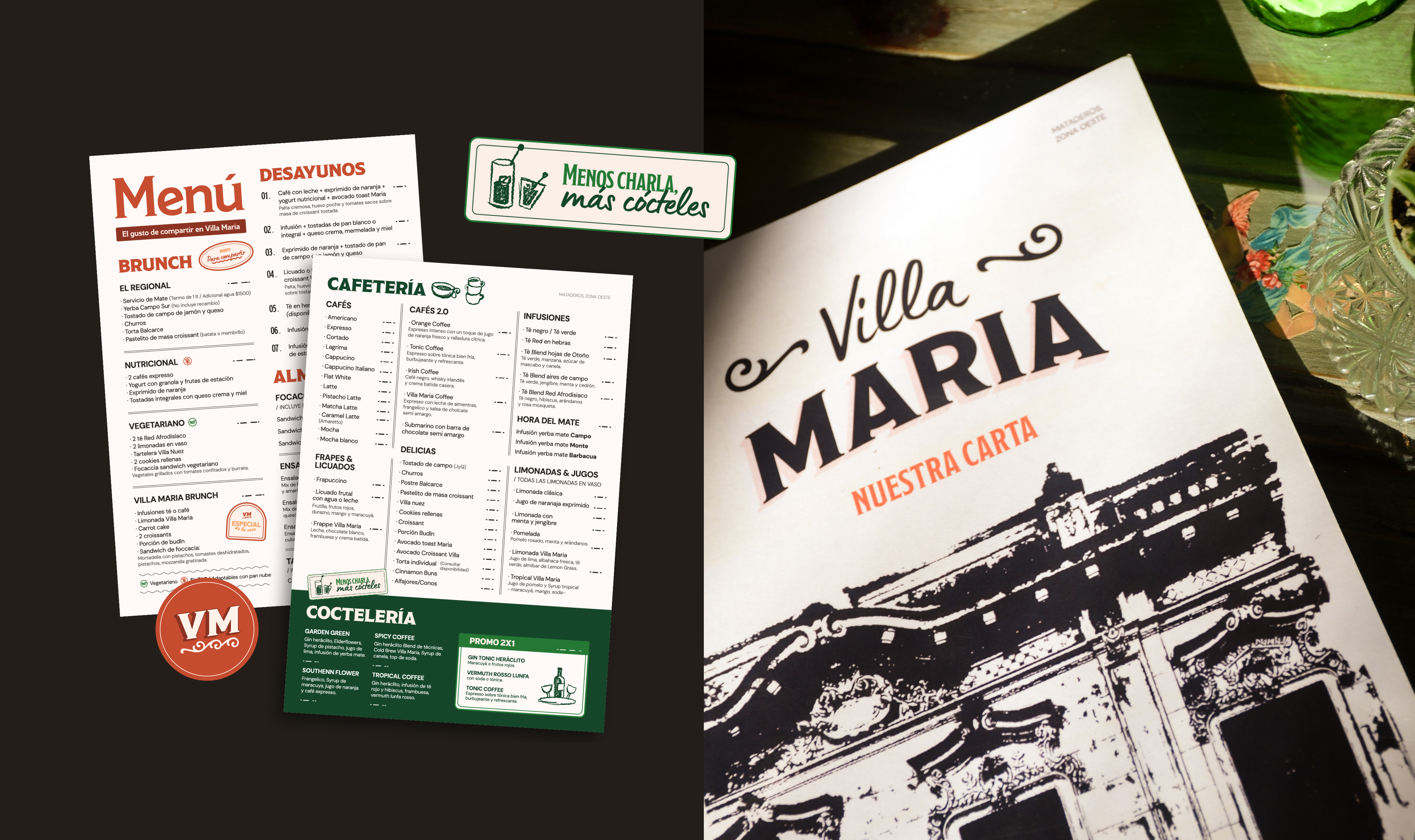
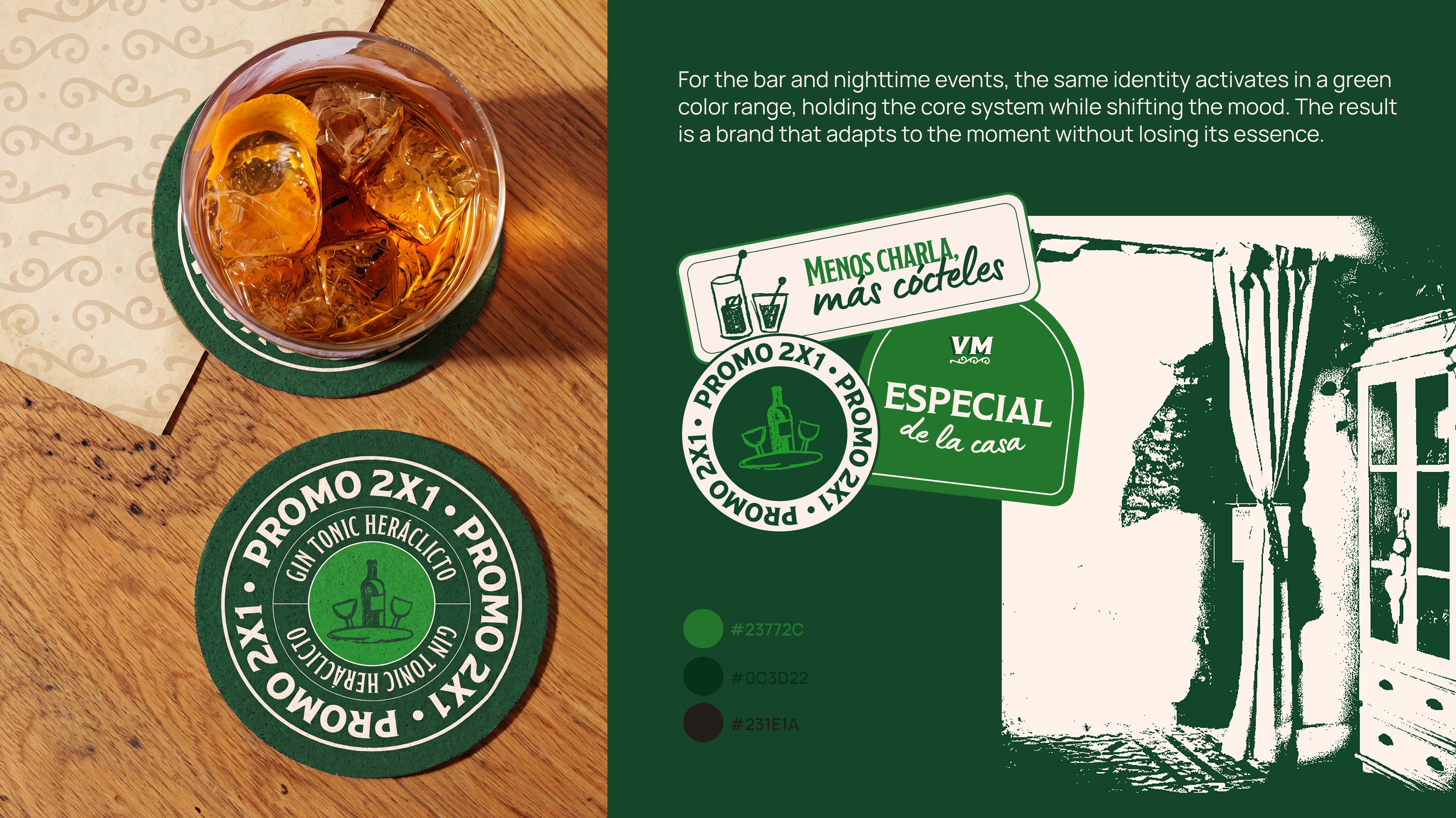
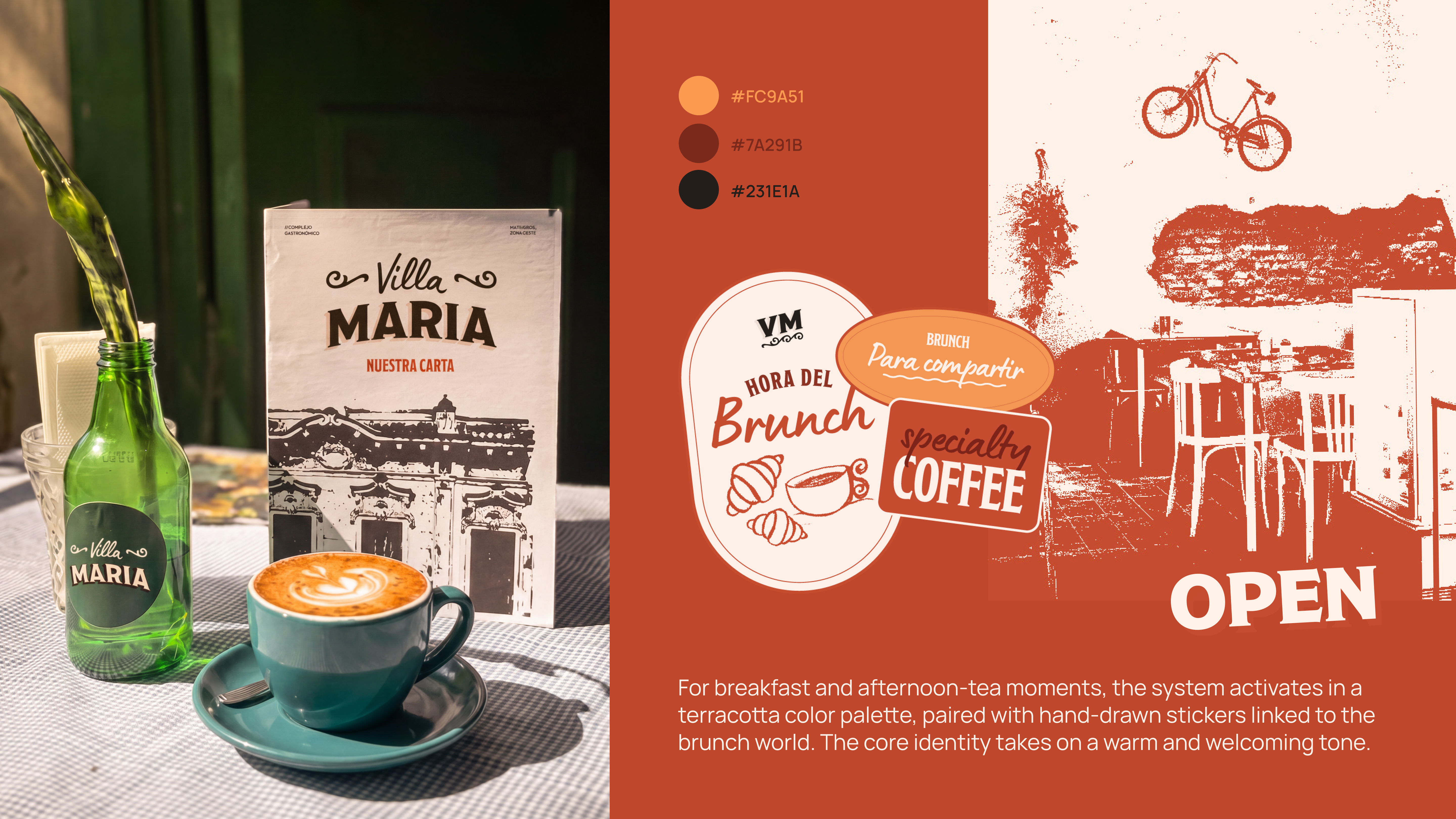
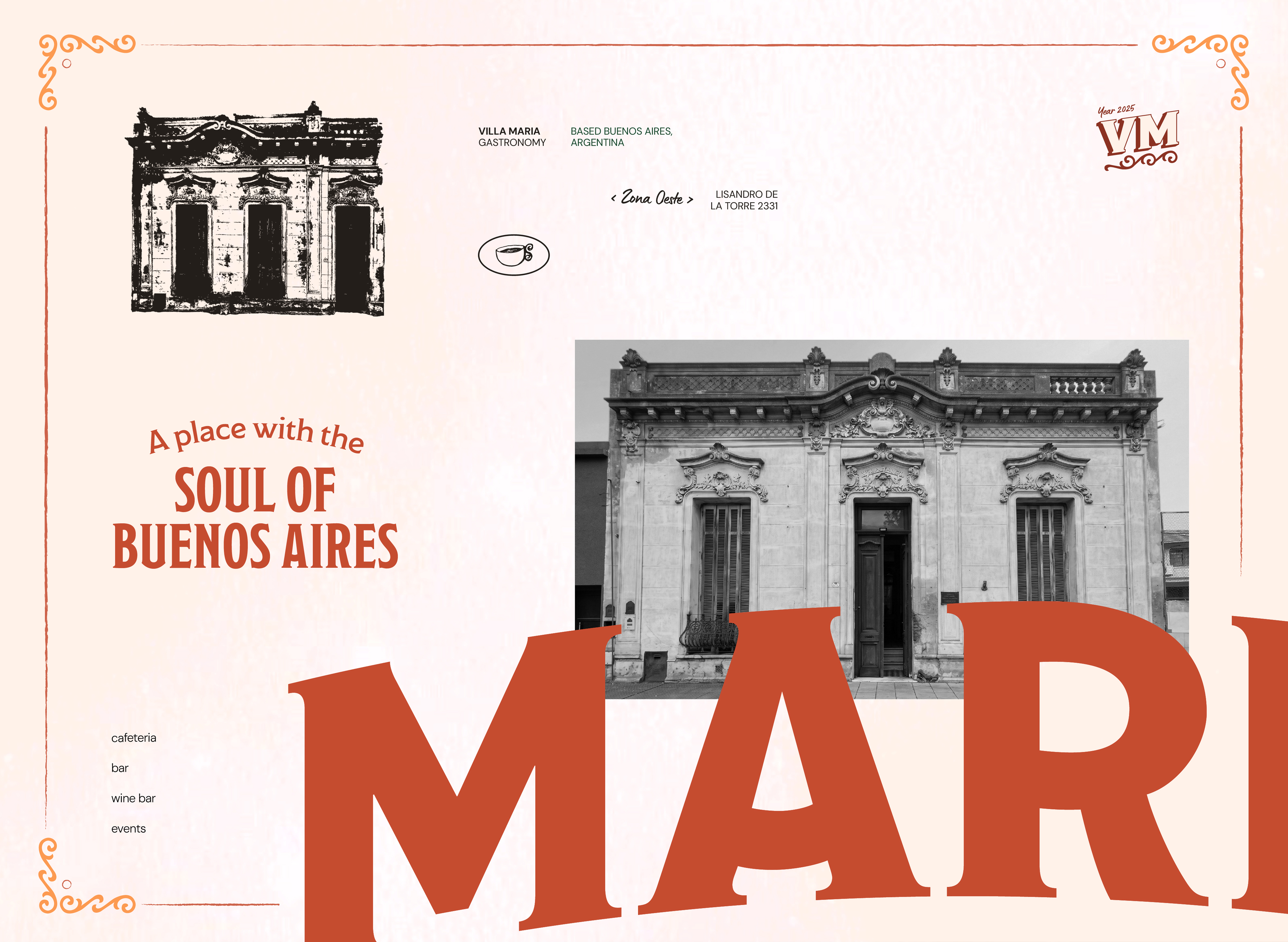
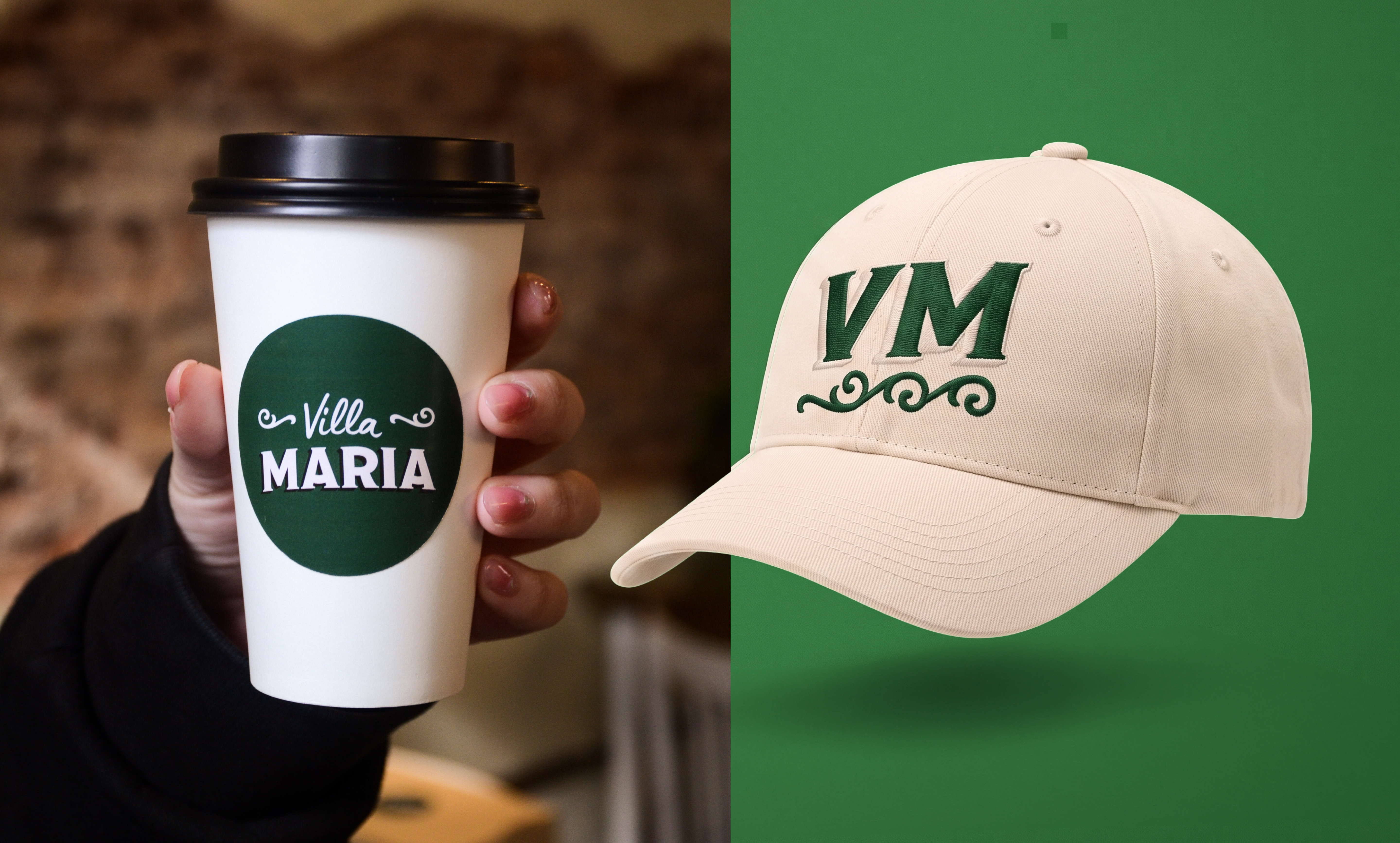
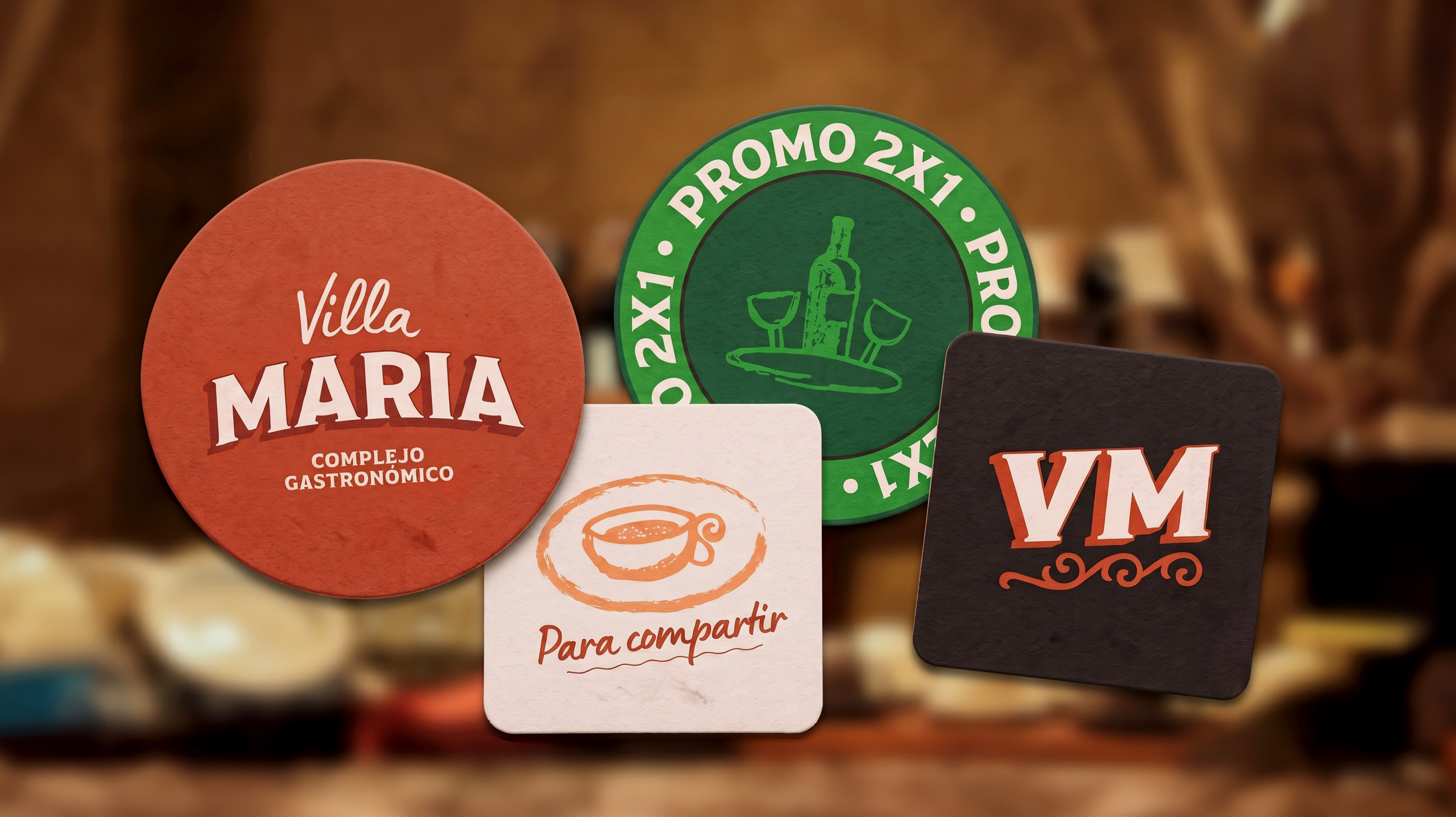
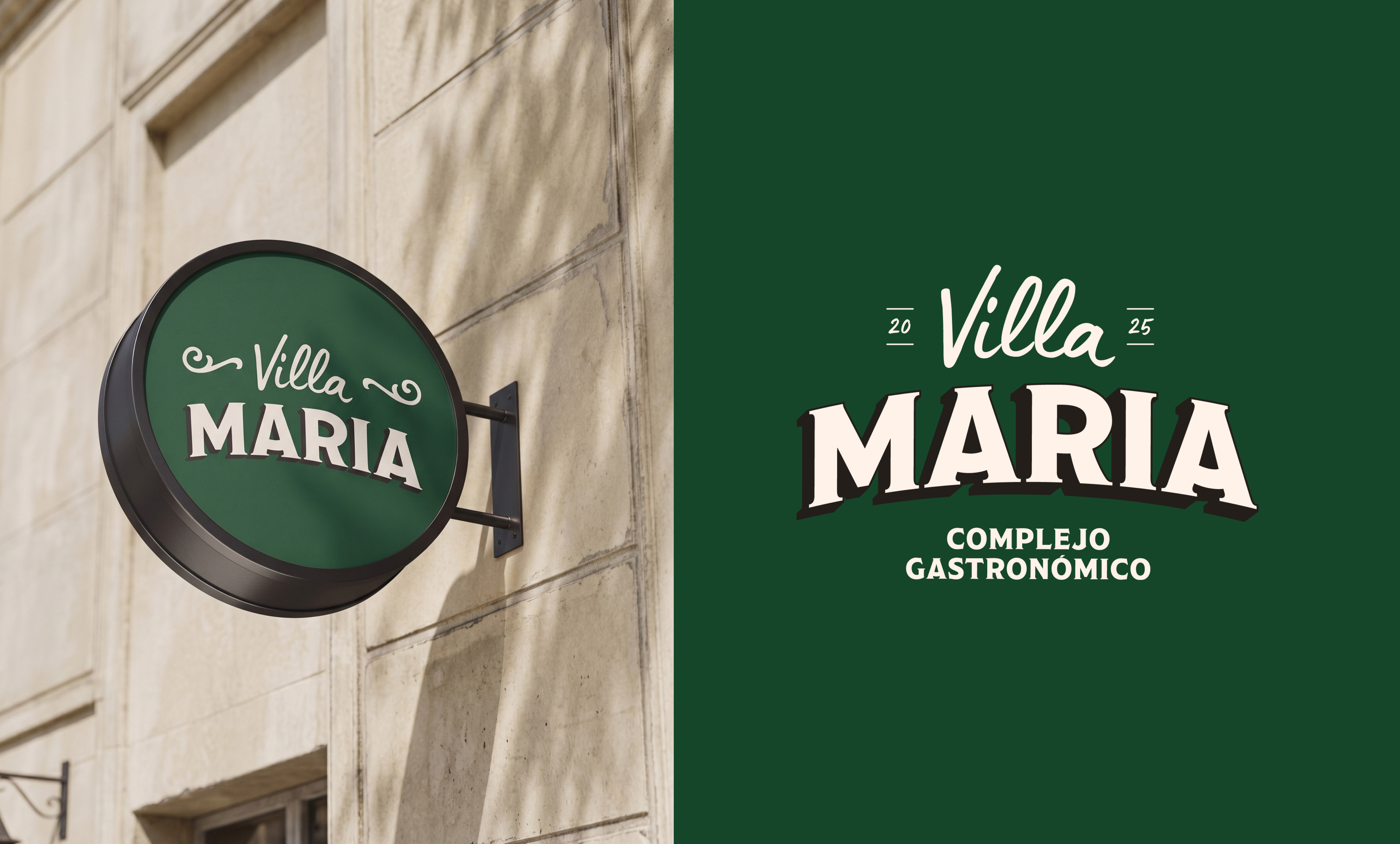
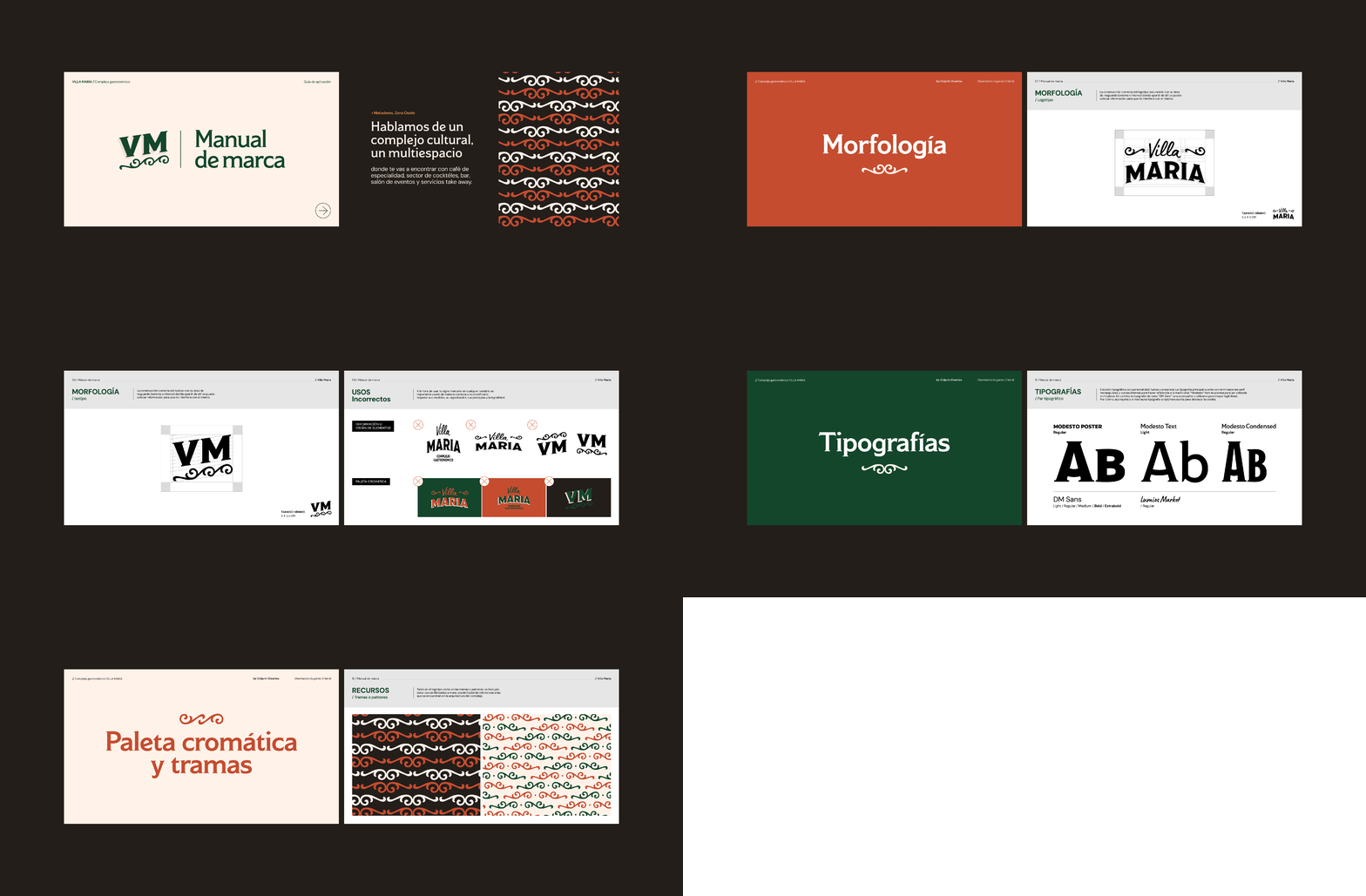
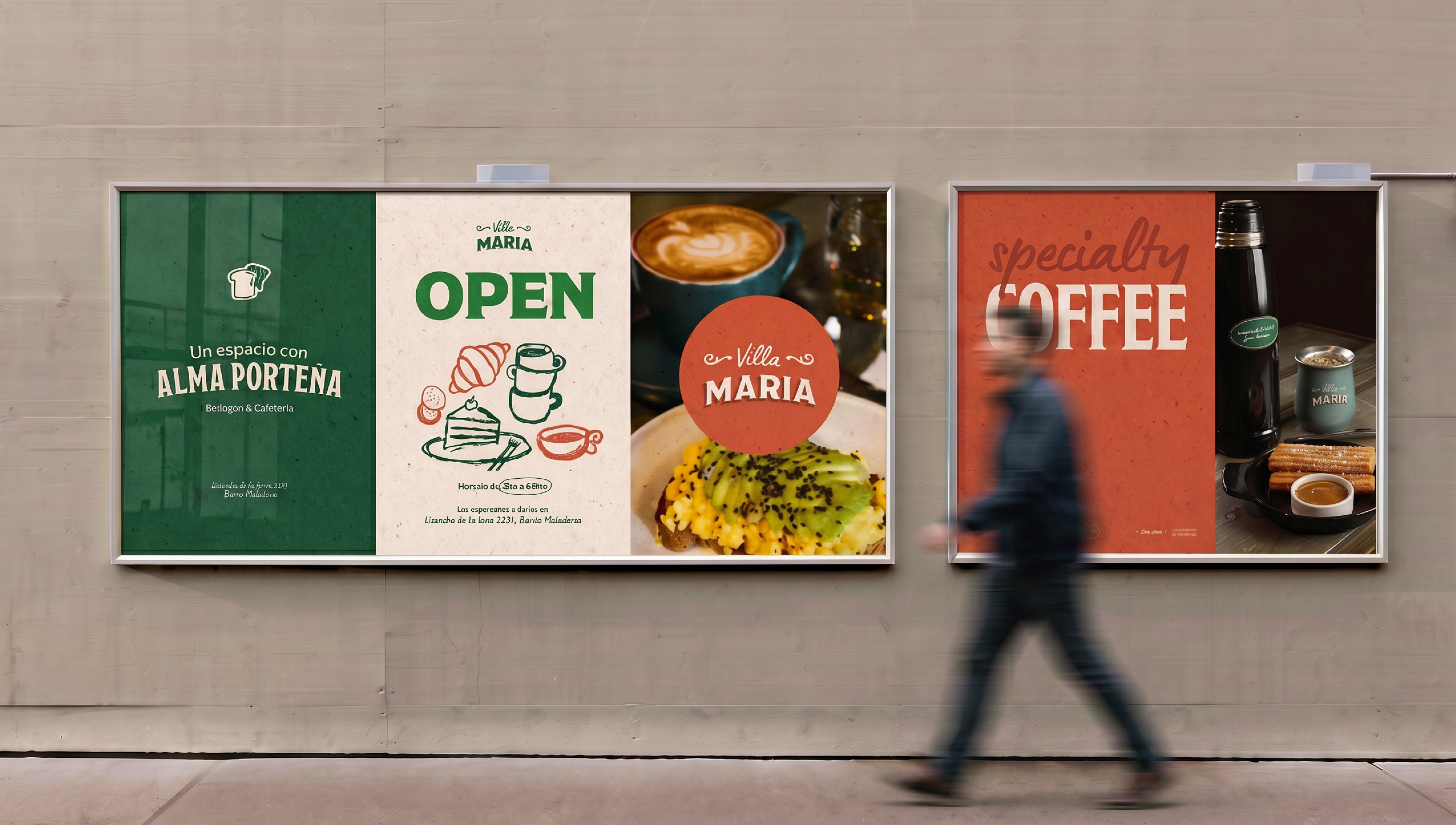
Villa María is a gastronomic complex located in Mataderos, Buenos Aires, operating as both a traditional bodegón and a café. It was born from the project of two friends looking to turn the space into a genuinely porteño meeting place. The logo draws on the fileteado porteño from the building's, the visual anchor of the entire identity.

Encender Comunicación
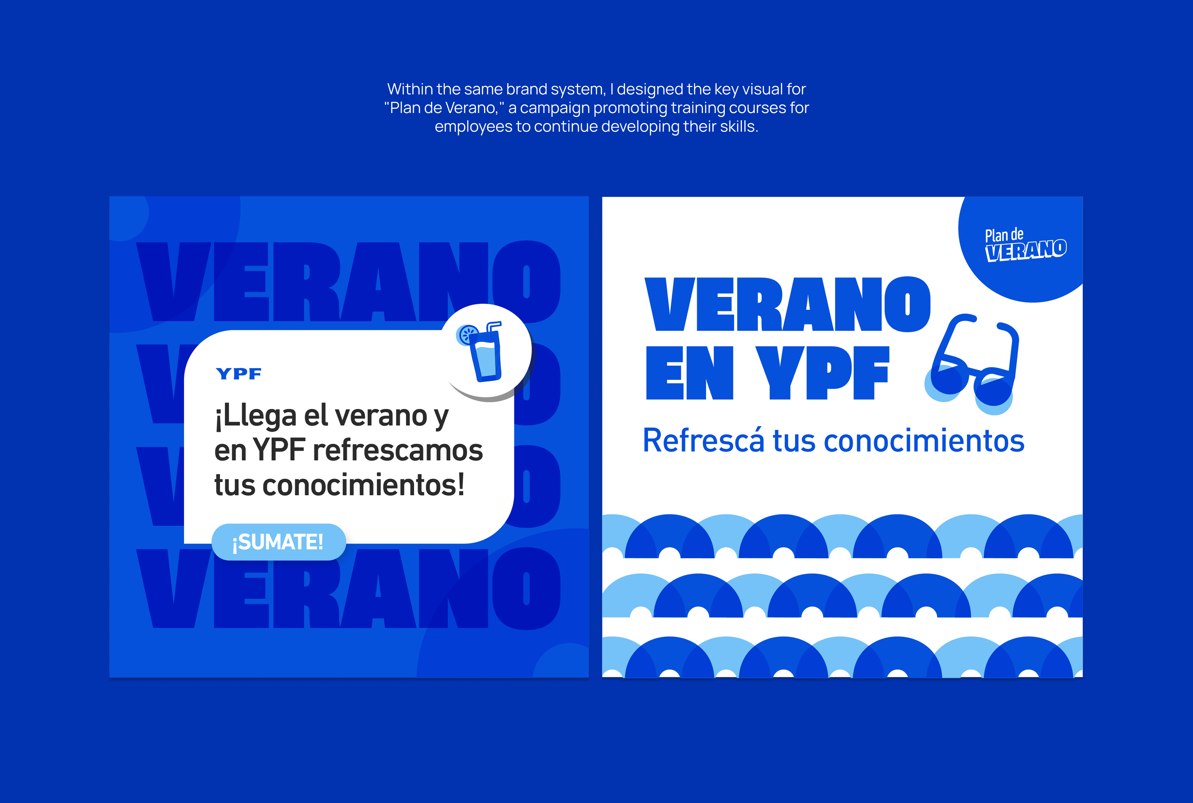
As graphic designer for the YPF team at "Encender Comunicación" agency, I worked on developing graphic pieces for the brand's internal communications.
I design campaigns alongside the team of project managers, content creators, editors, and directors.
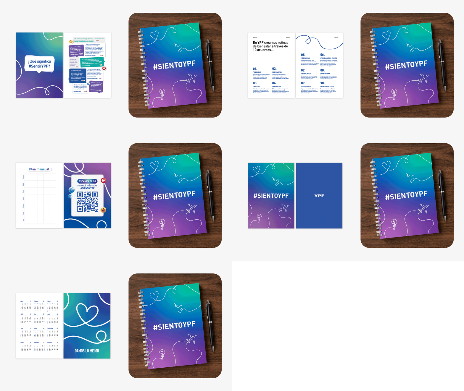
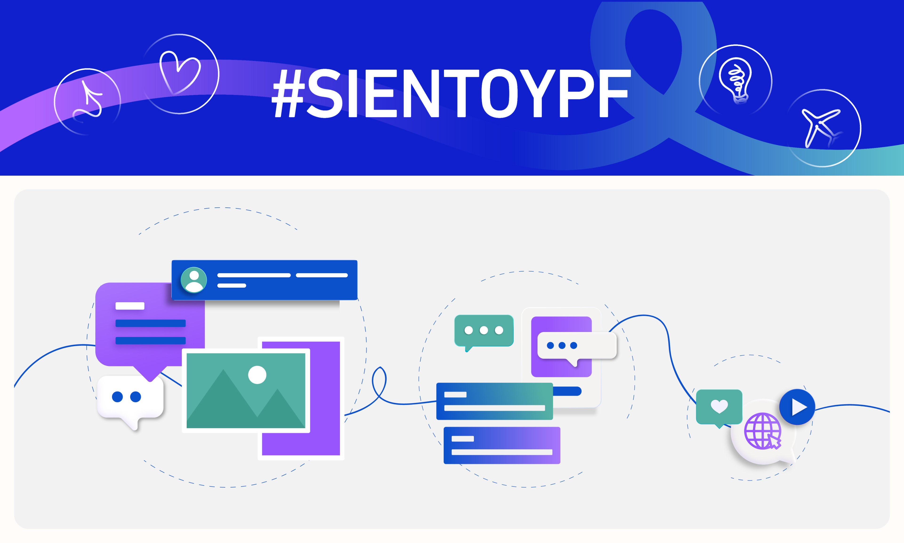
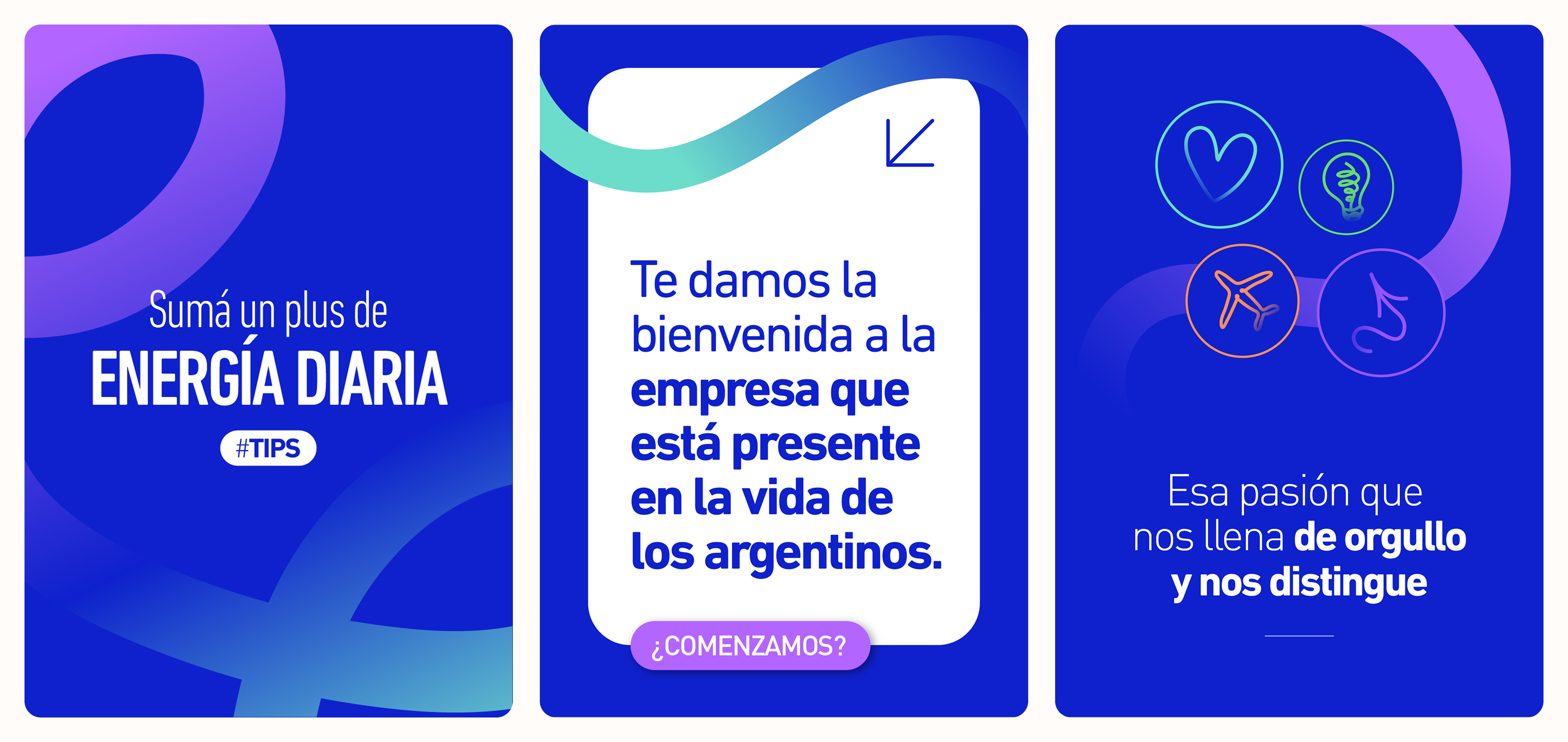
Working within YPF's already defined brand system, I developed the key visual for "Good Habits," a campaign focused on organization and teamwork within the offices. The piece held the brand identity while adapting it to the program's specific message.
Internal communication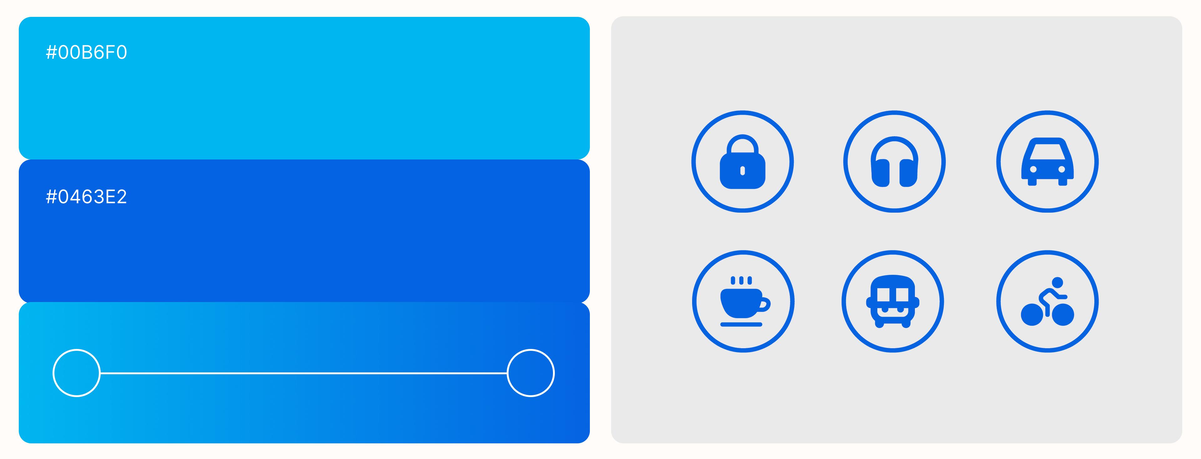
we'll keep the conversation going
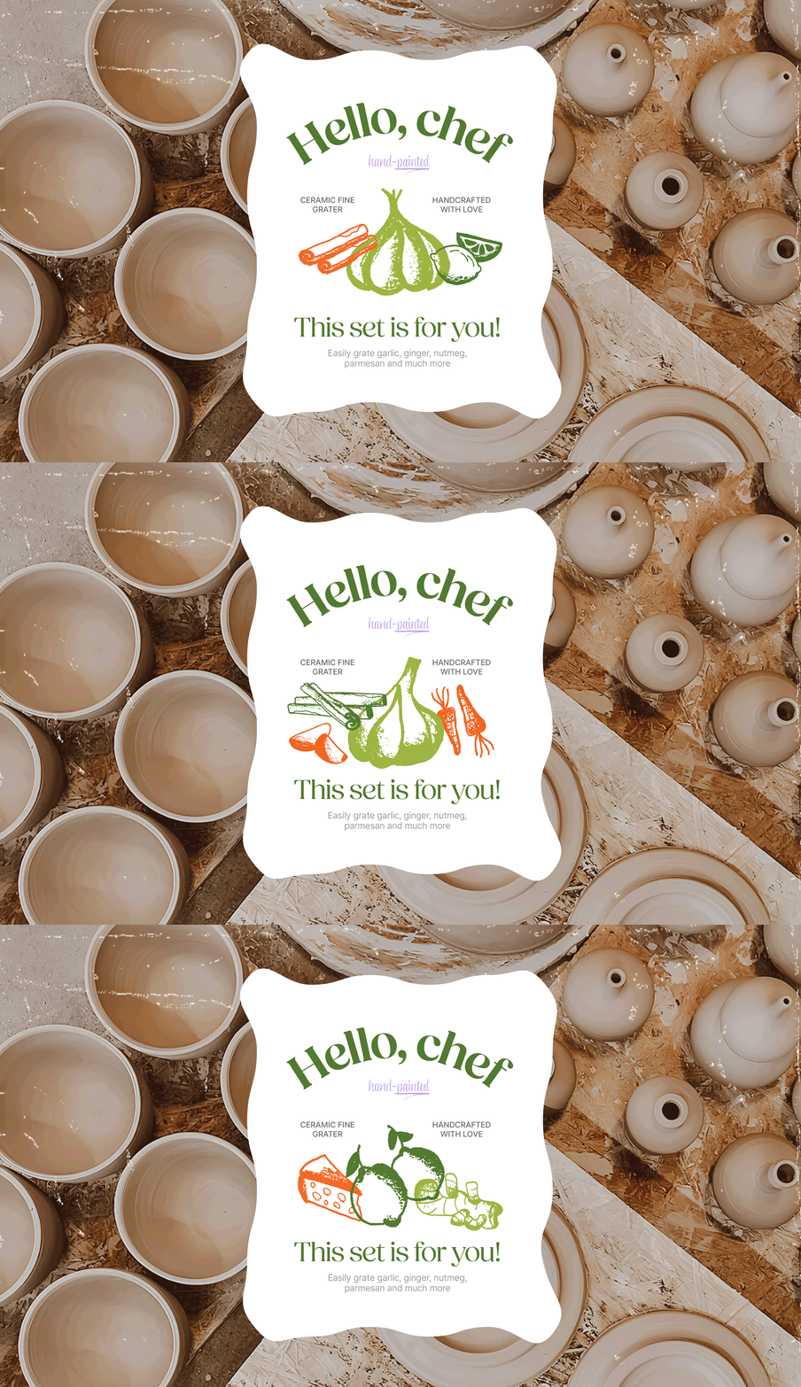
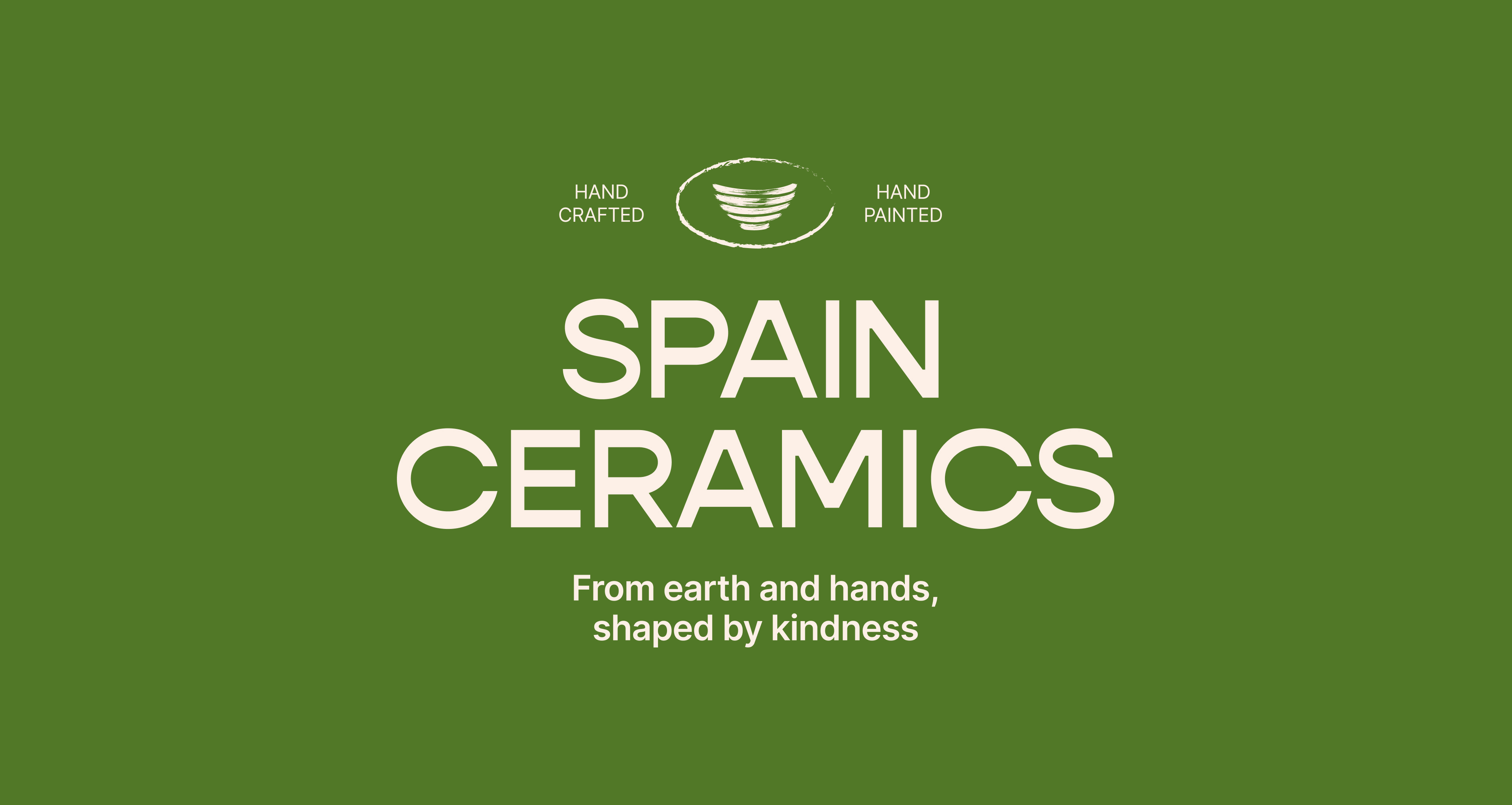
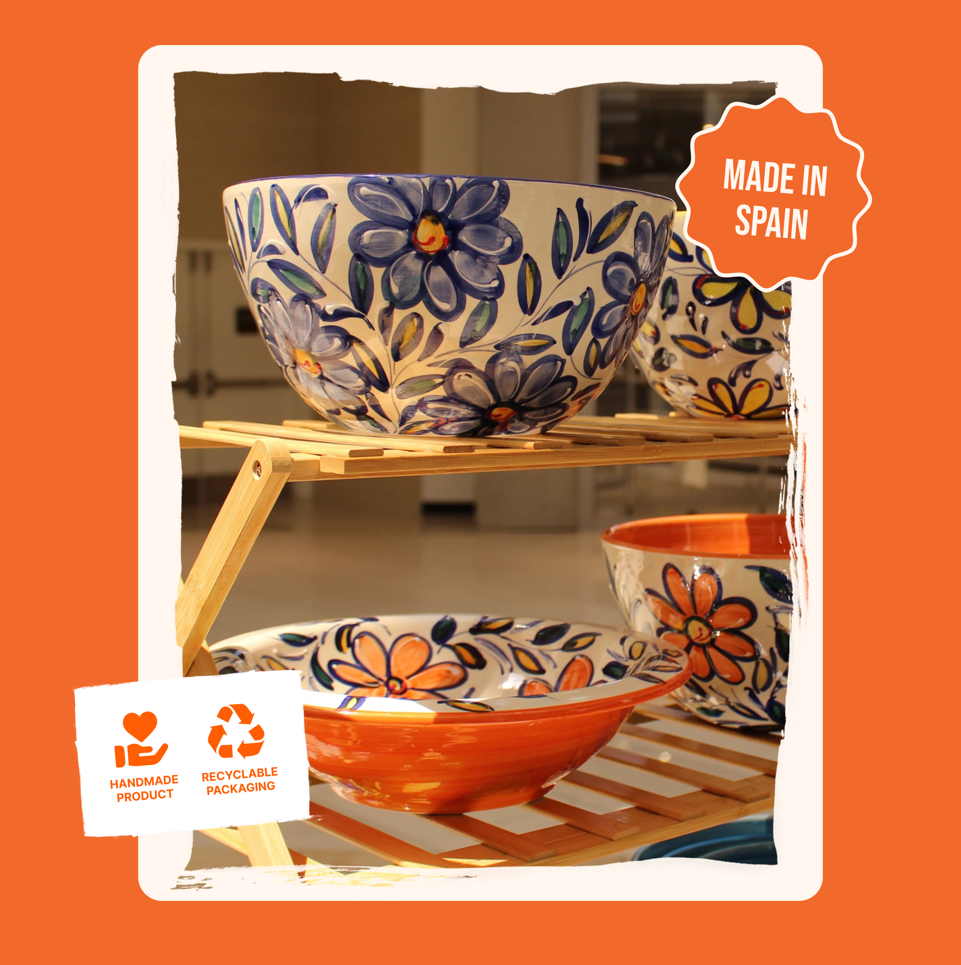
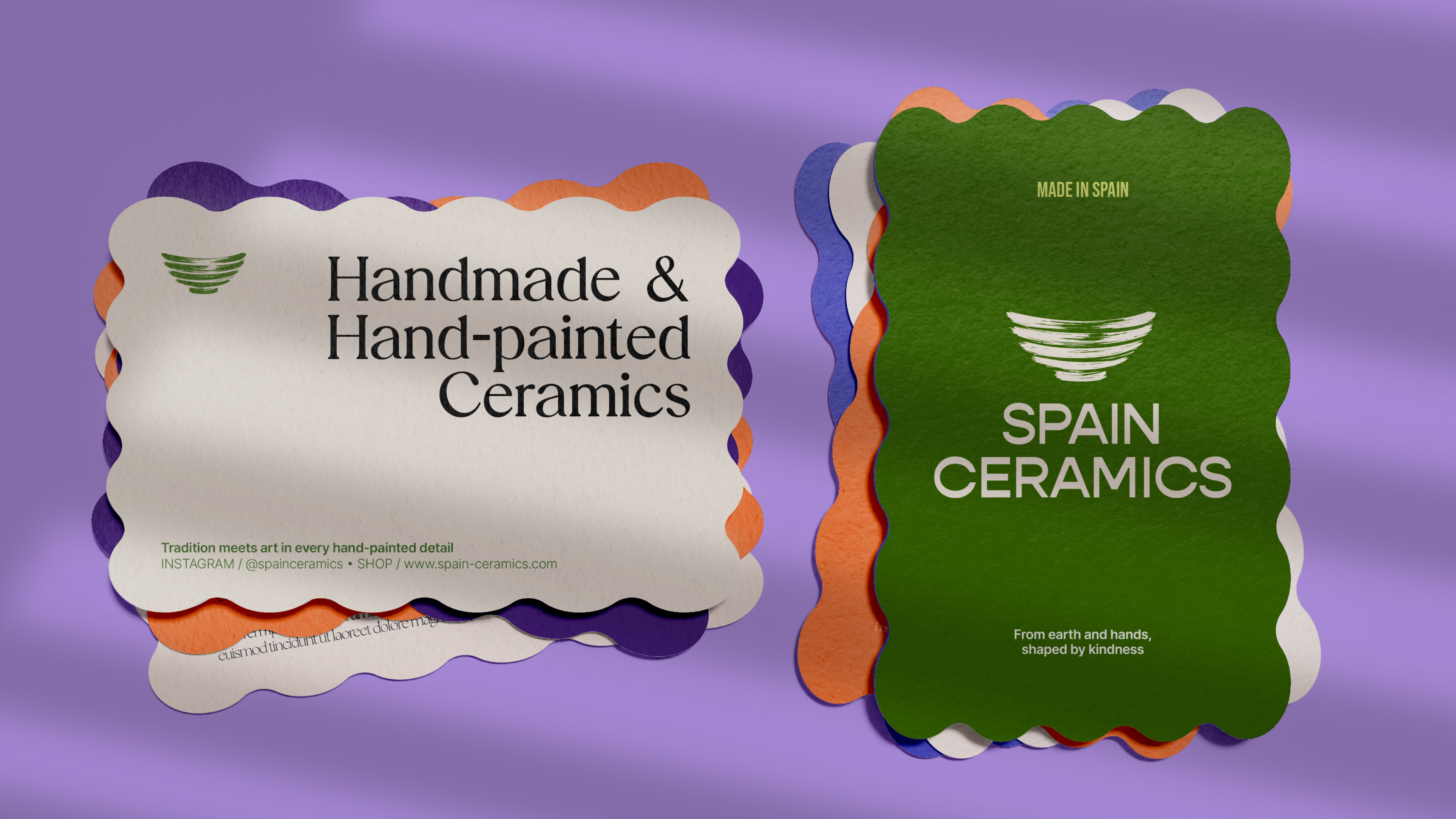
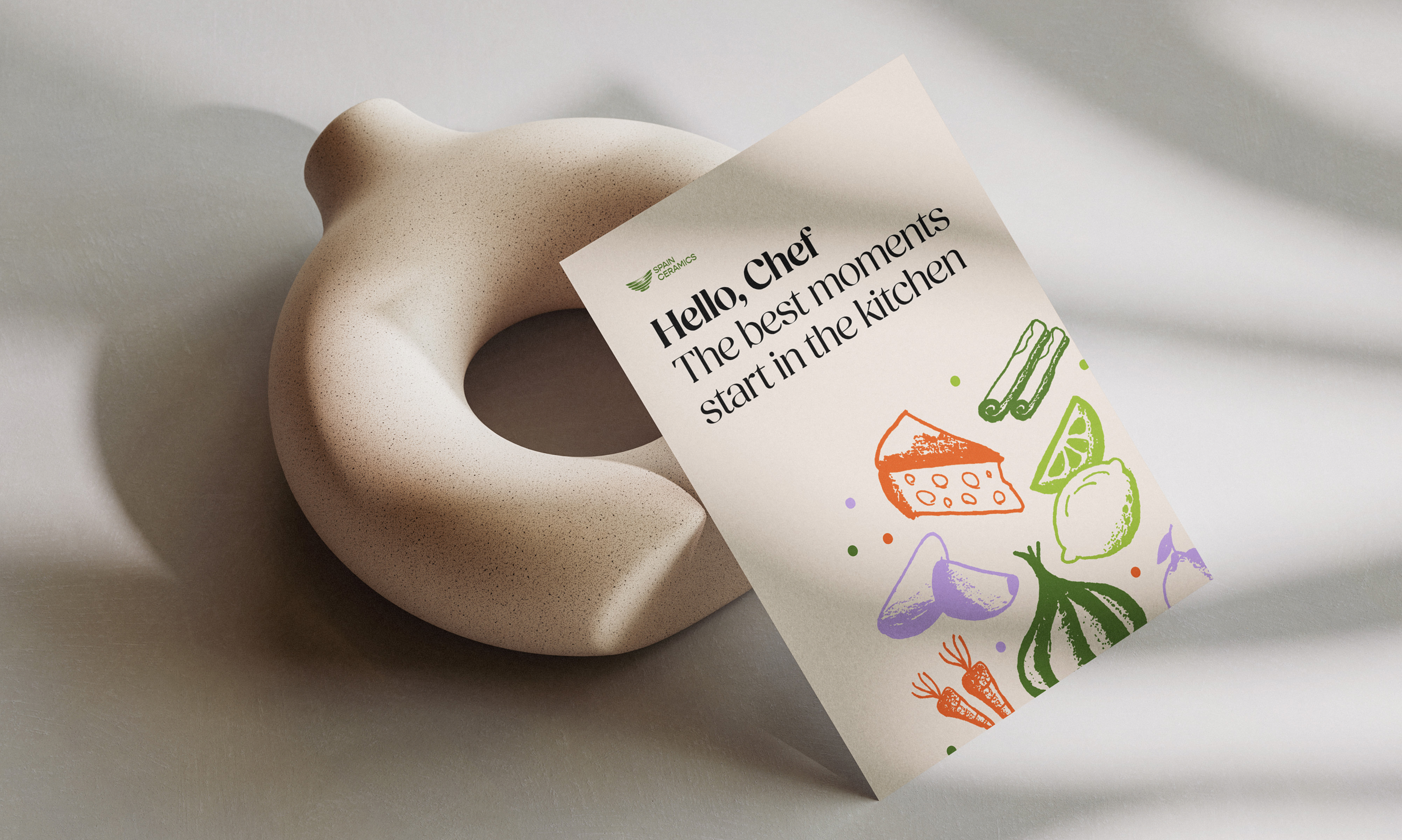
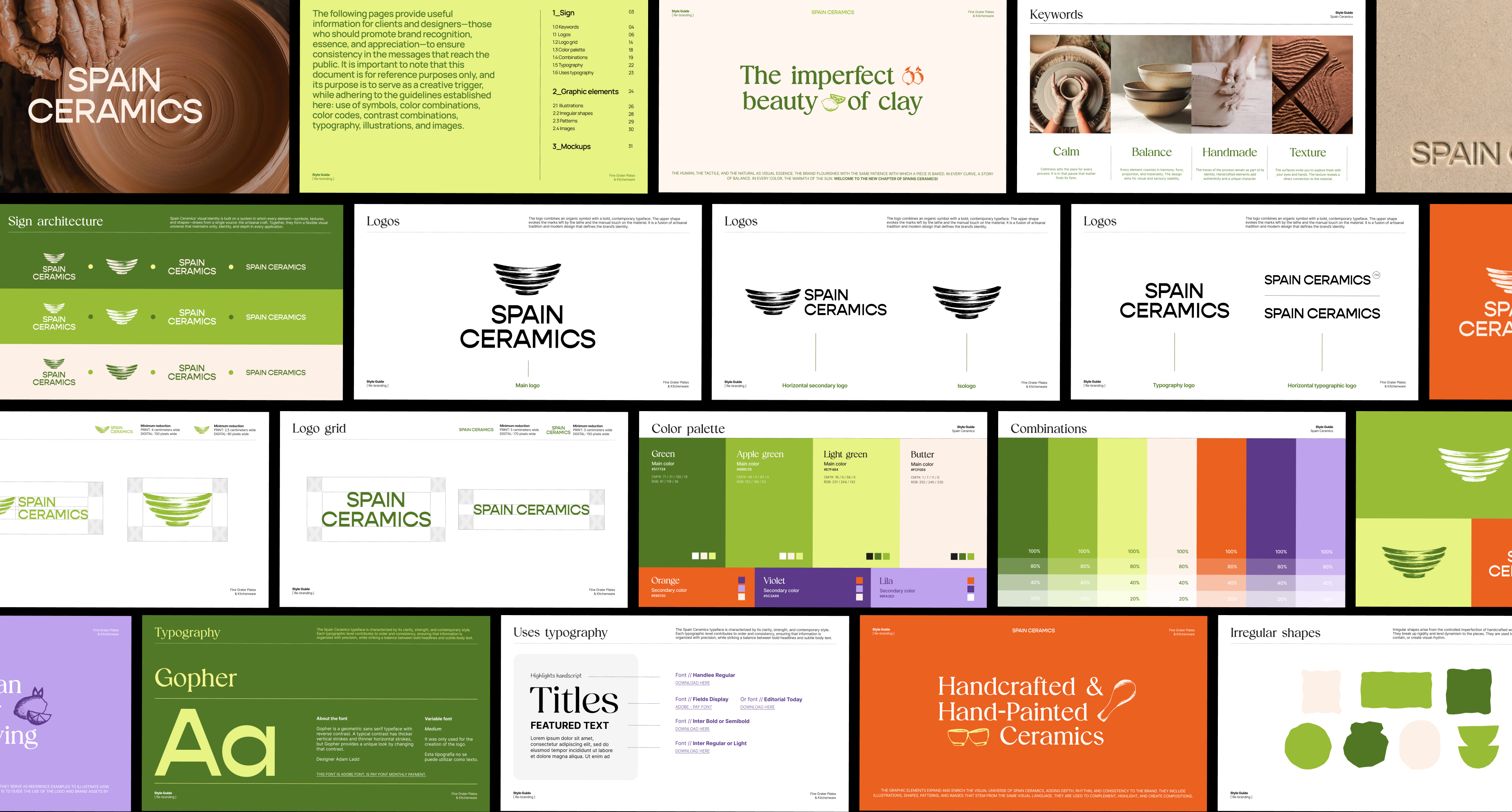
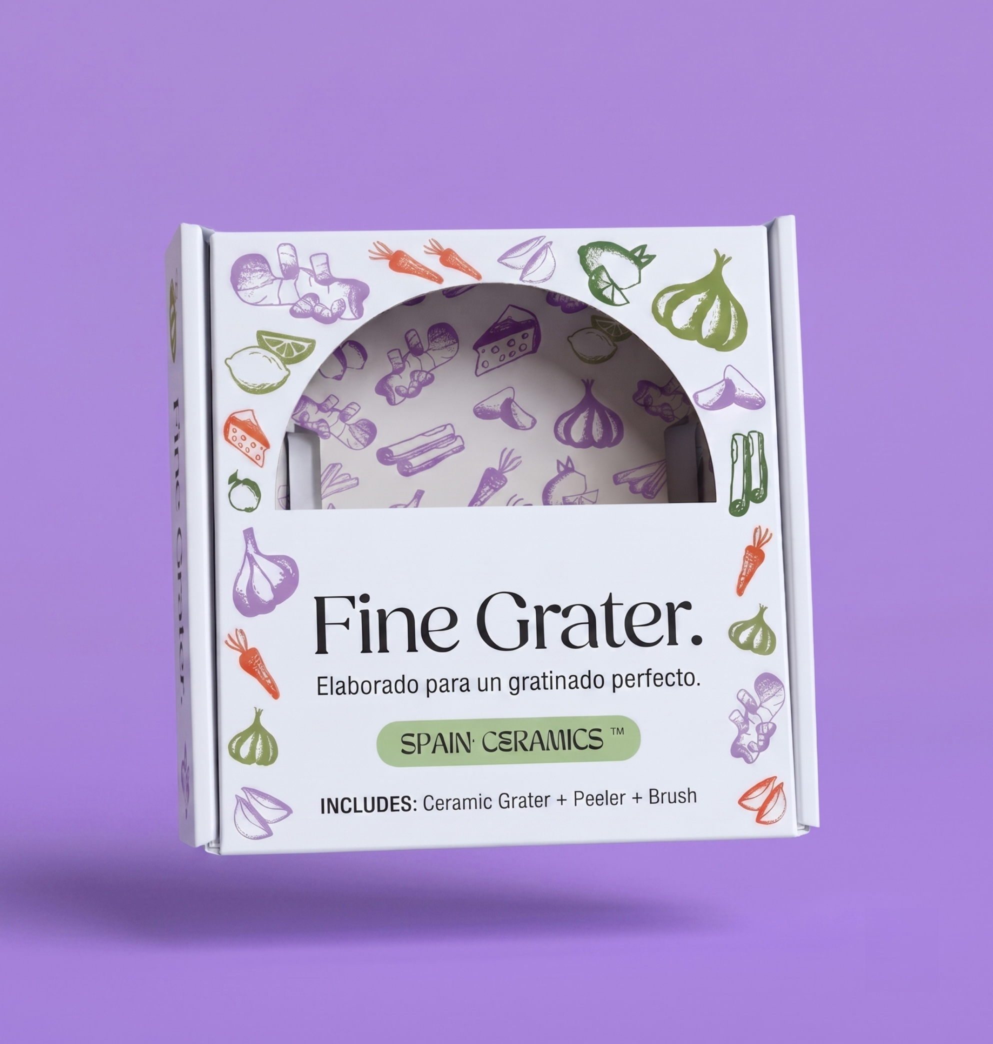
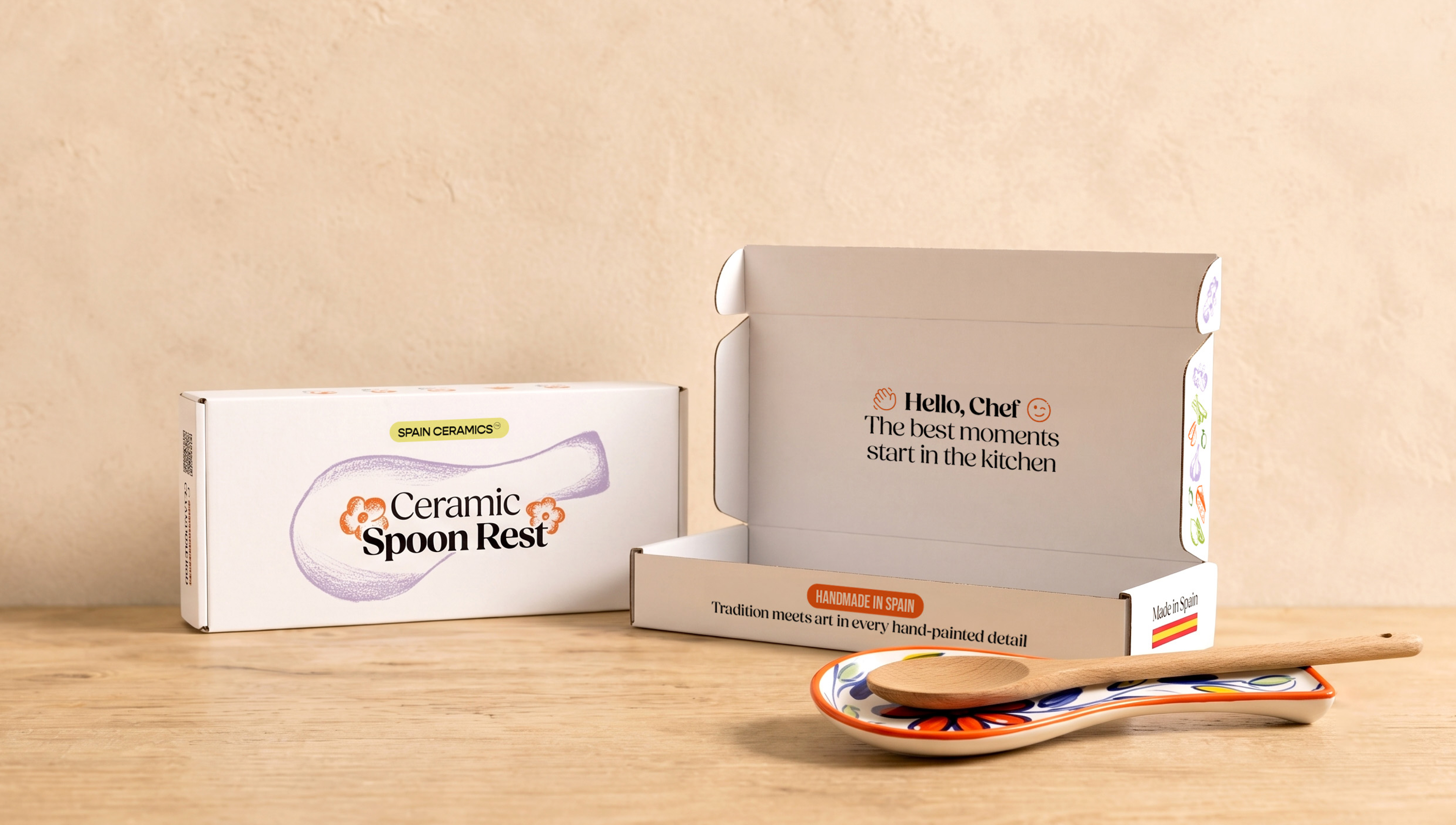
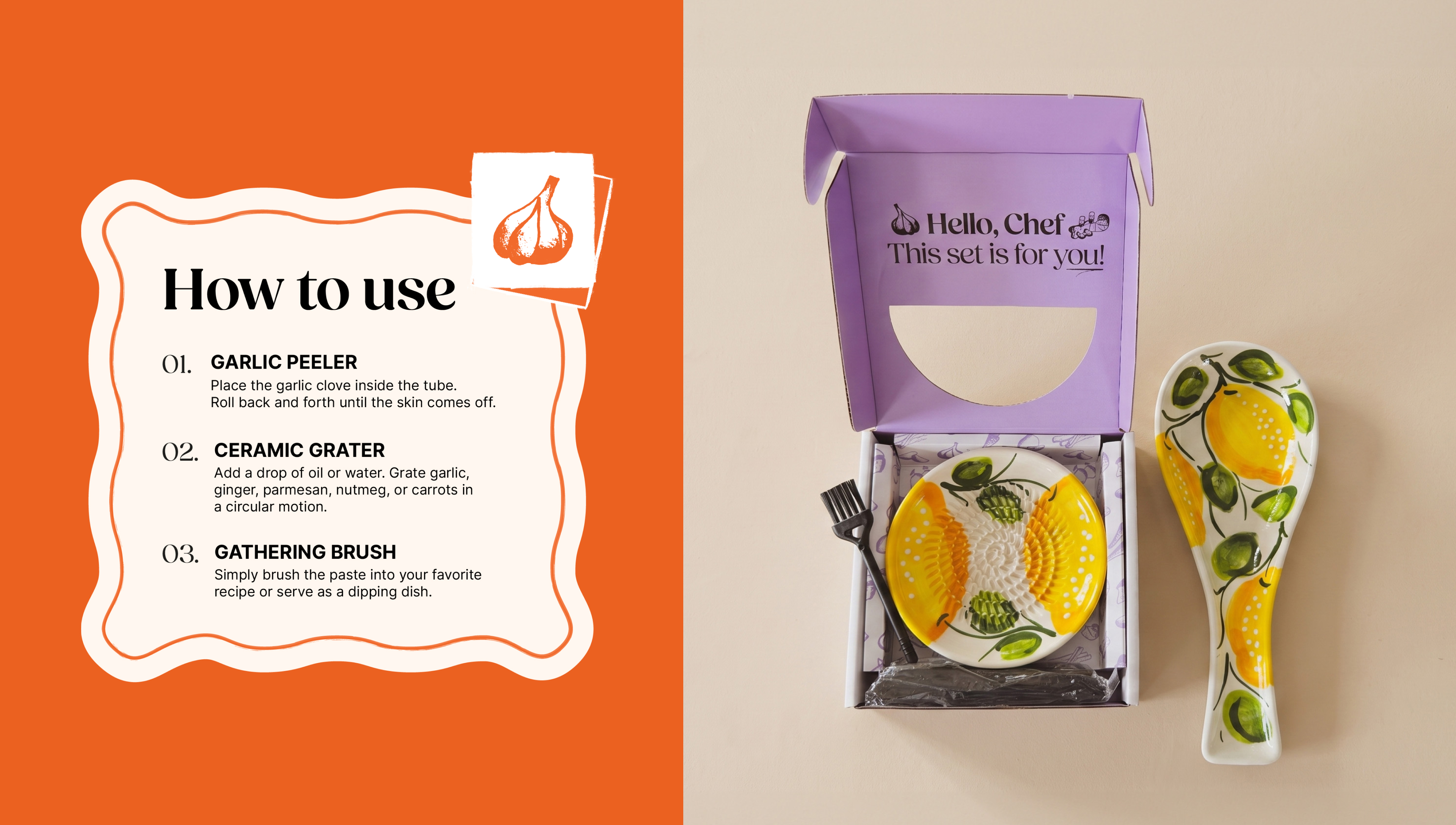
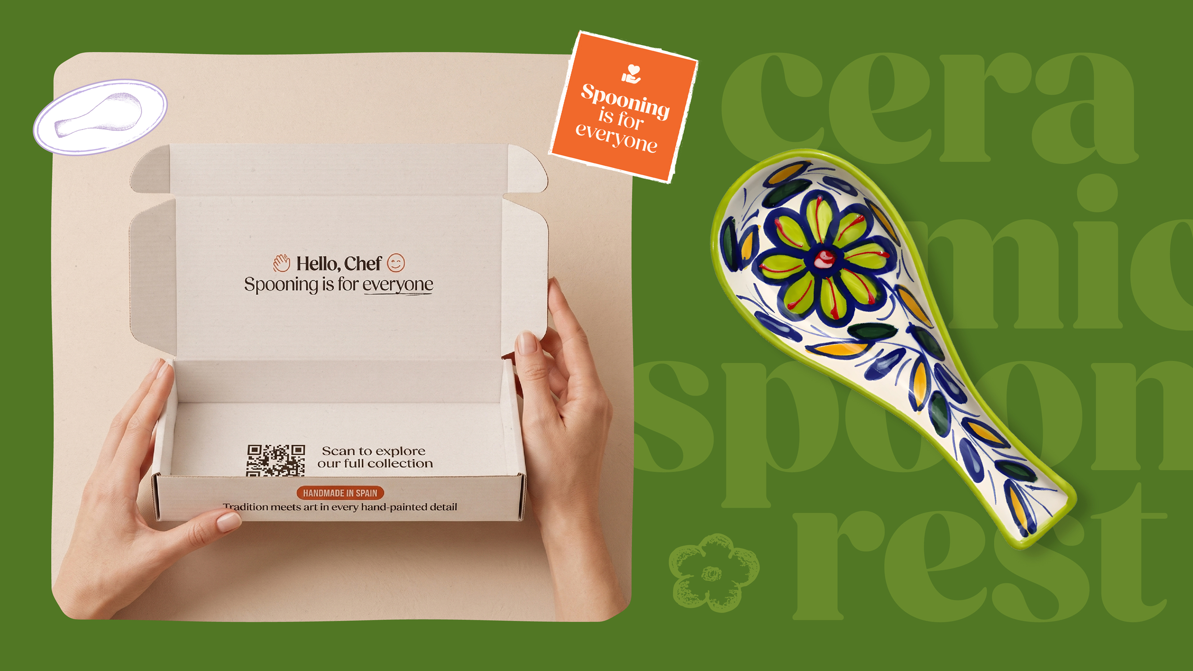
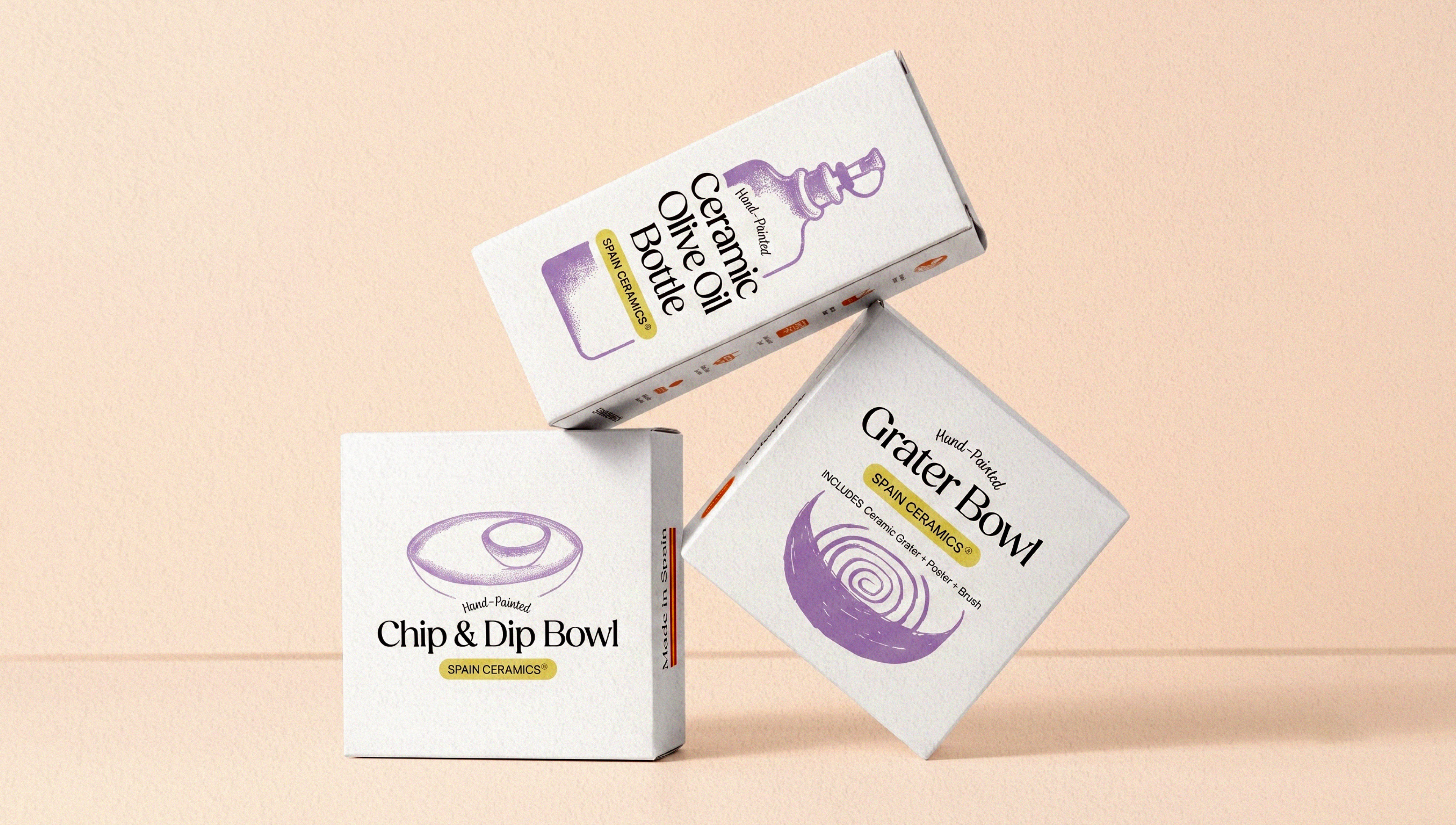
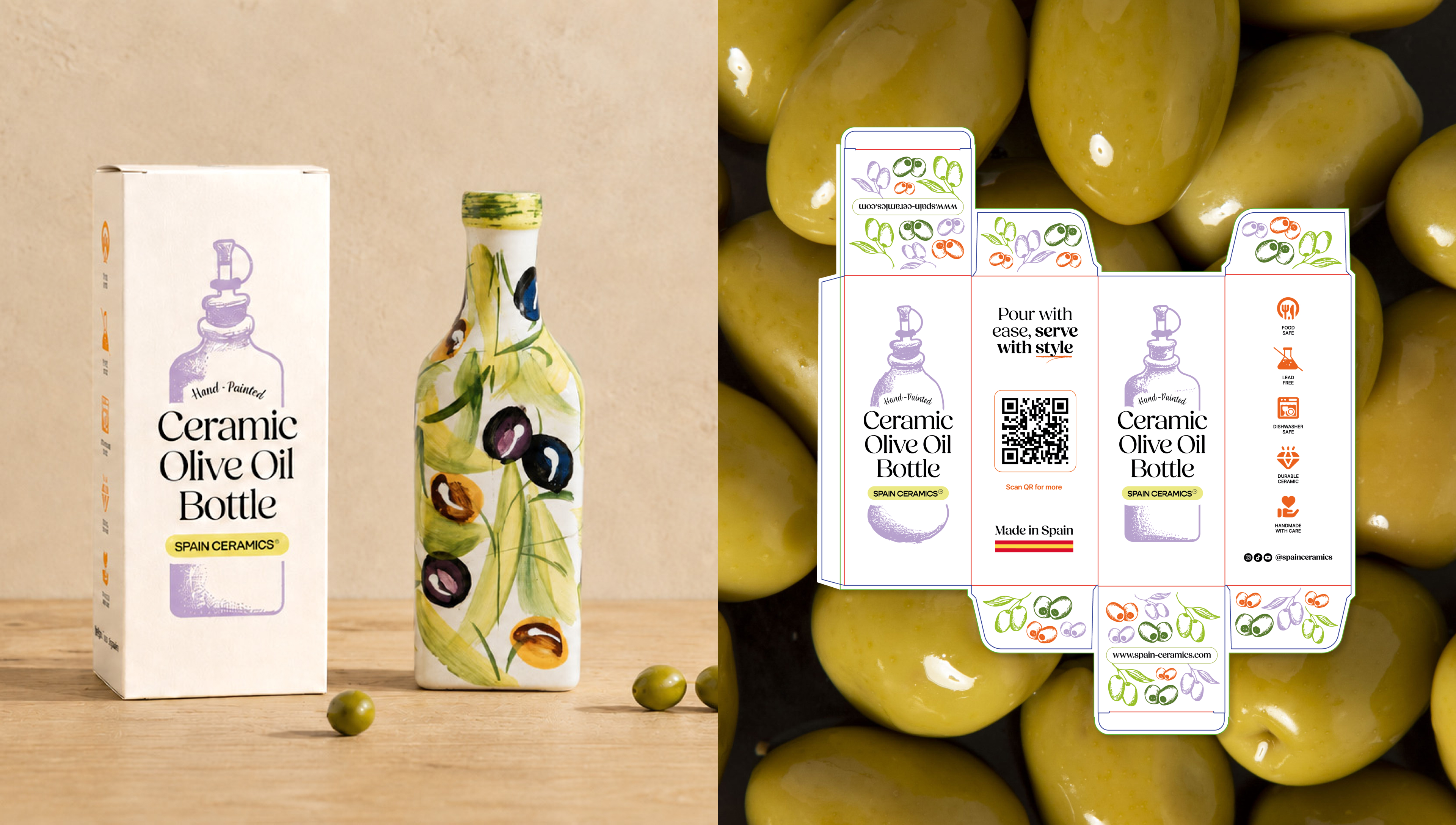
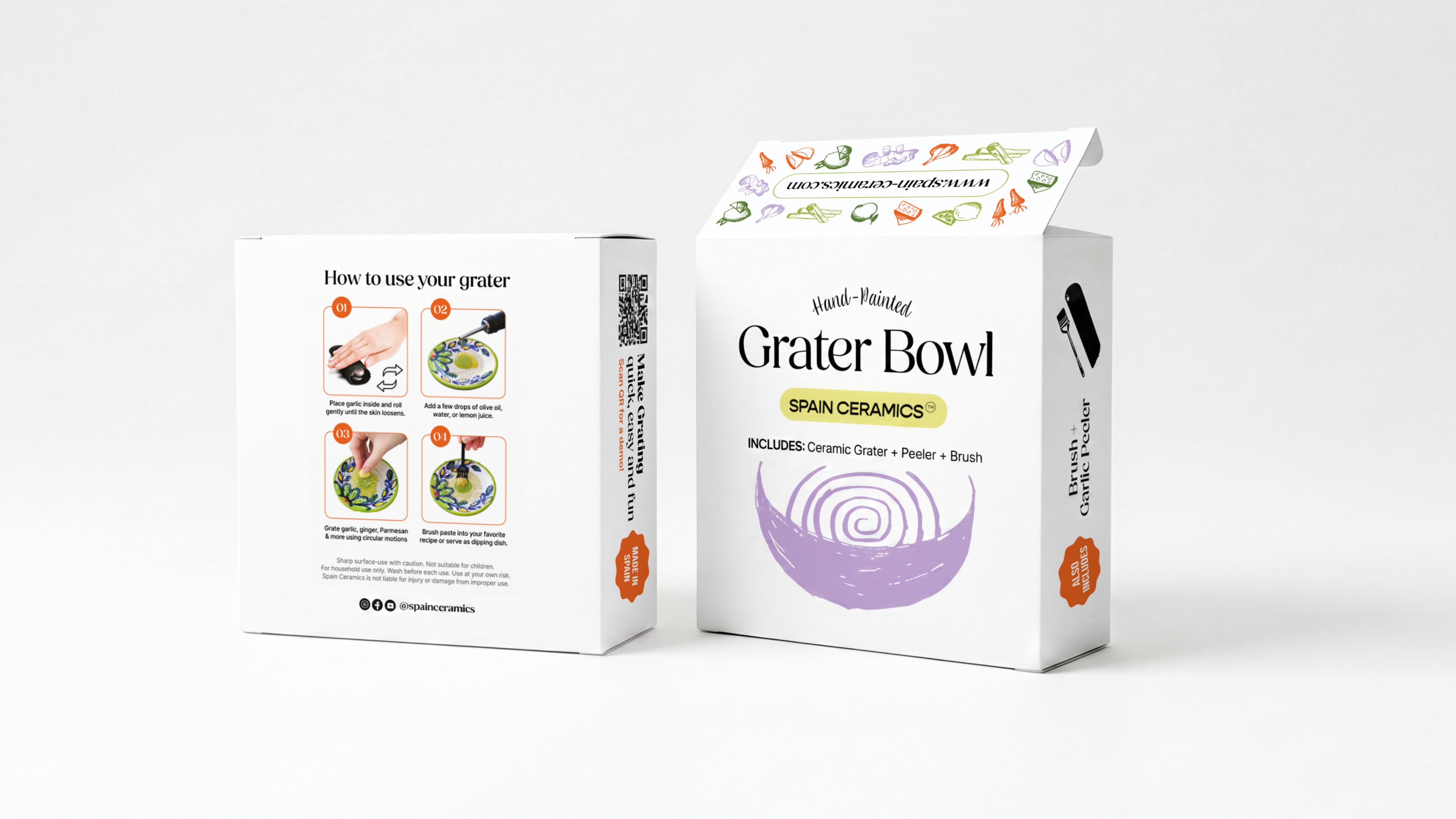
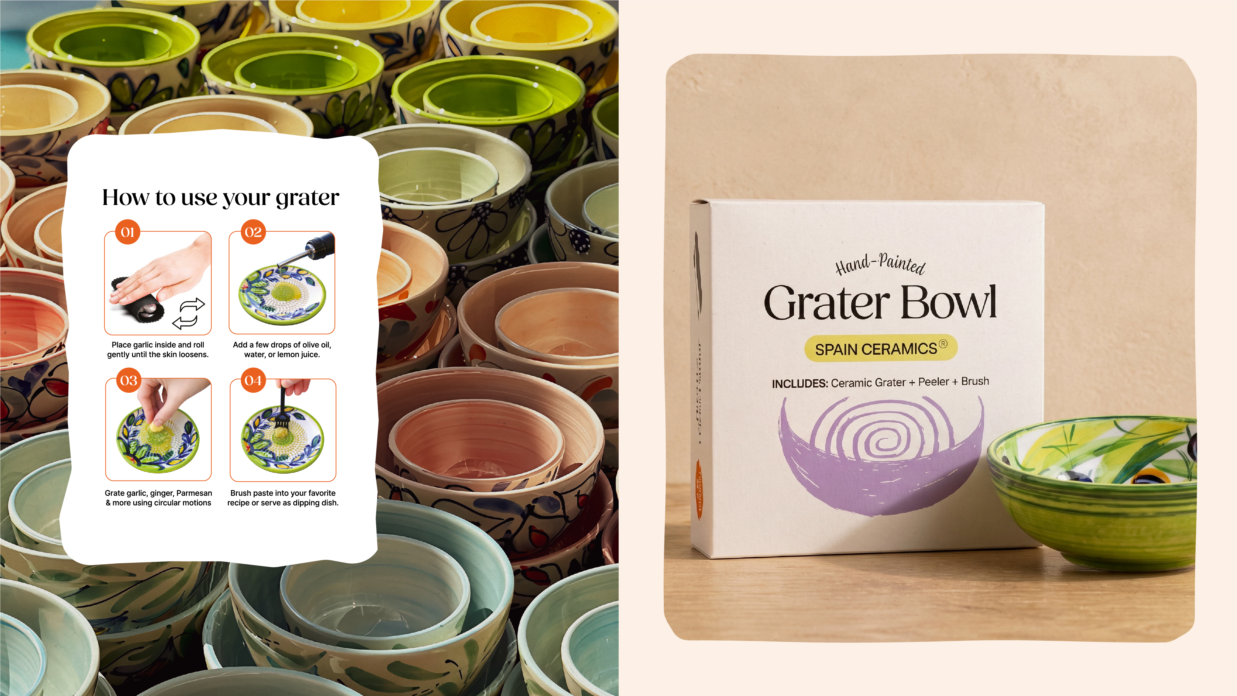
Spain Ceramics brings Mediterranean tradition into kitchens around the world. I directed the rebrand from concept to result: a ceramic bowl built from gestural brushstrokes as the brand's central symbol, a hand-drawn palette and illustration system, and an identity that gives Spain Ceramics structure — and a language to keep growing.
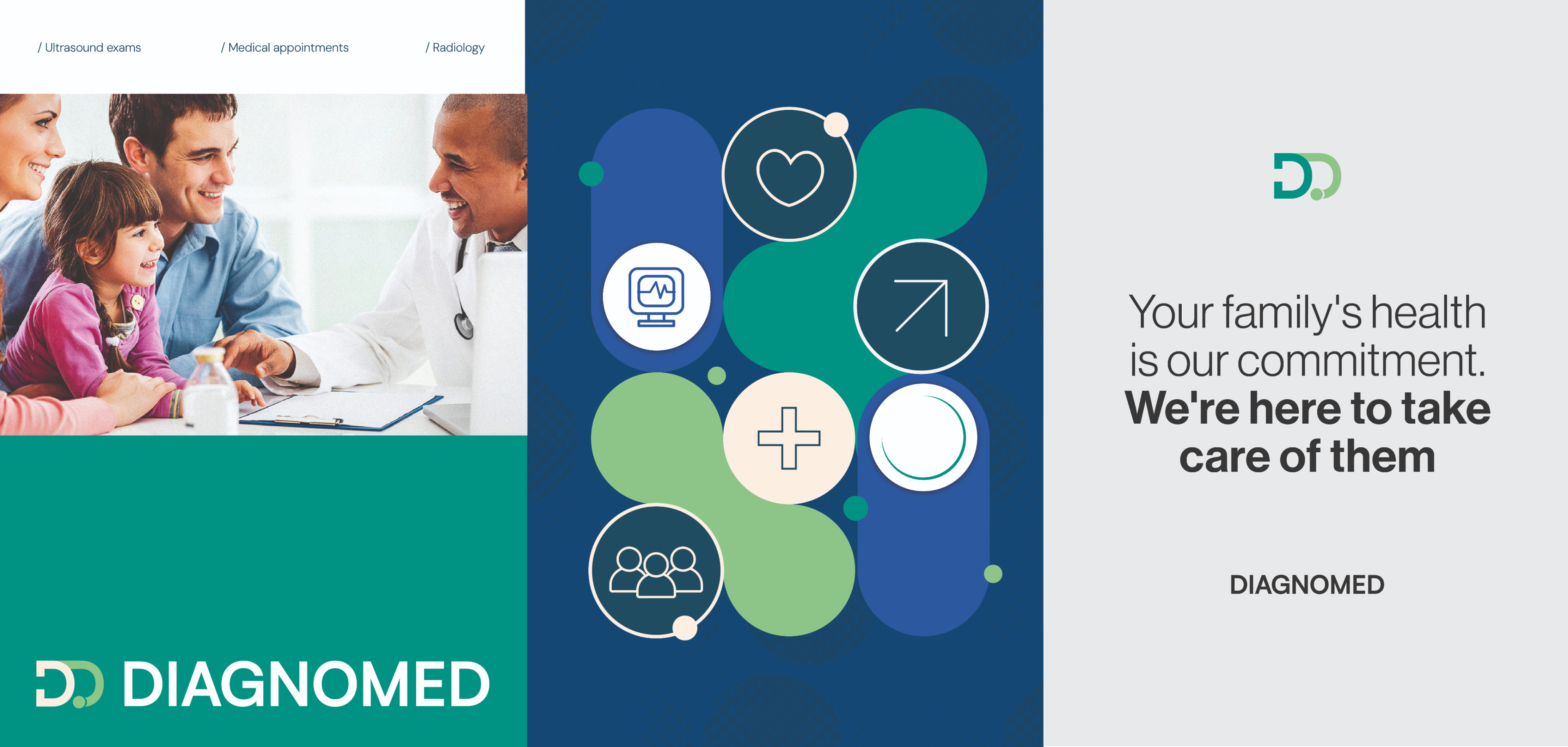
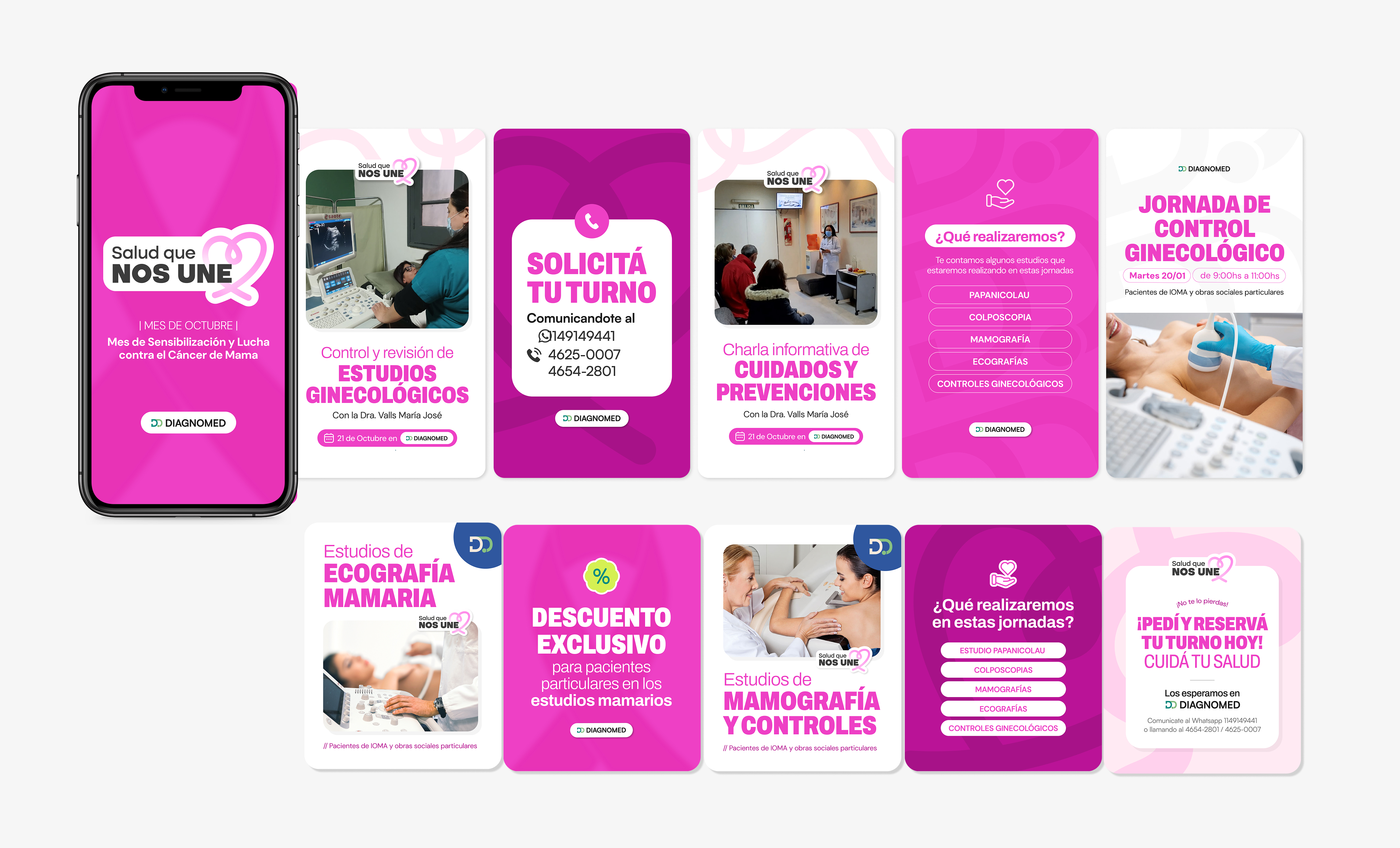
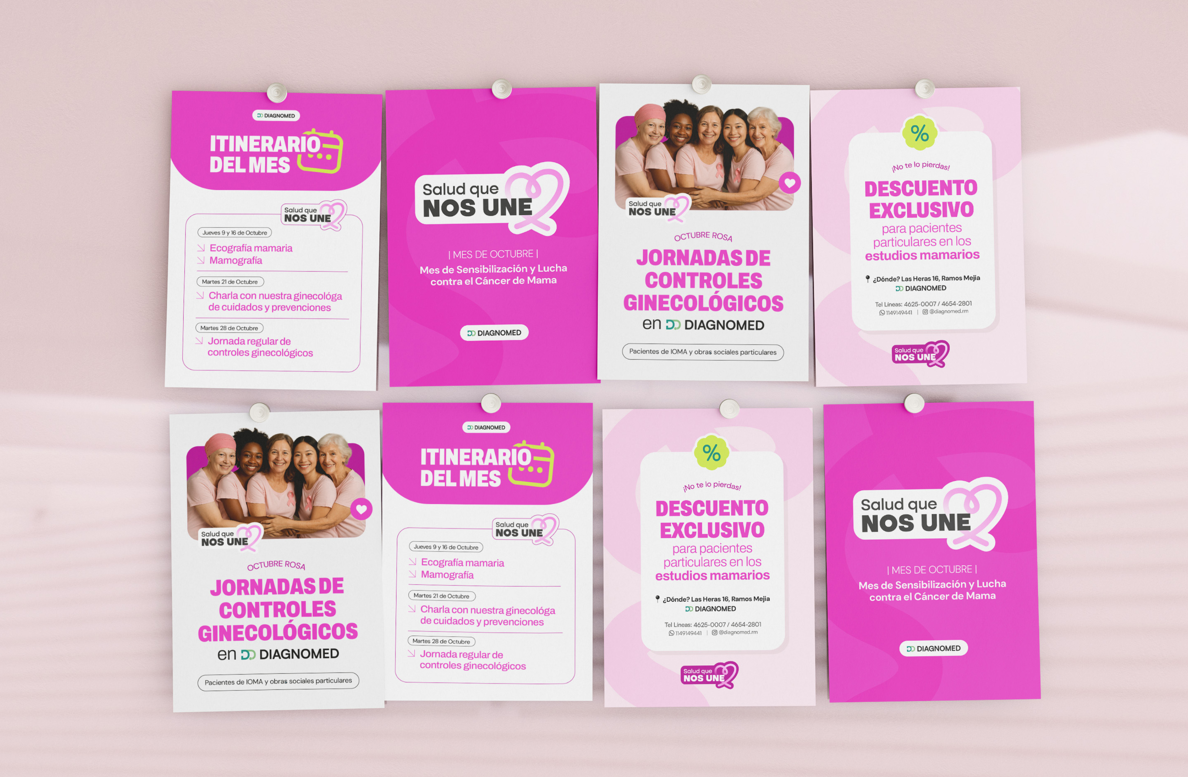
Diagnomed began as a medical center specialized in diagnostic imaging, with a clear projection toward new specialties. The challenge was to build an identity able to hold both stages of the brand, without limiting its future growth. The answer was Diagnomed: a fusion of "diagnóstico" and "médico" that works at every stage of the brand.

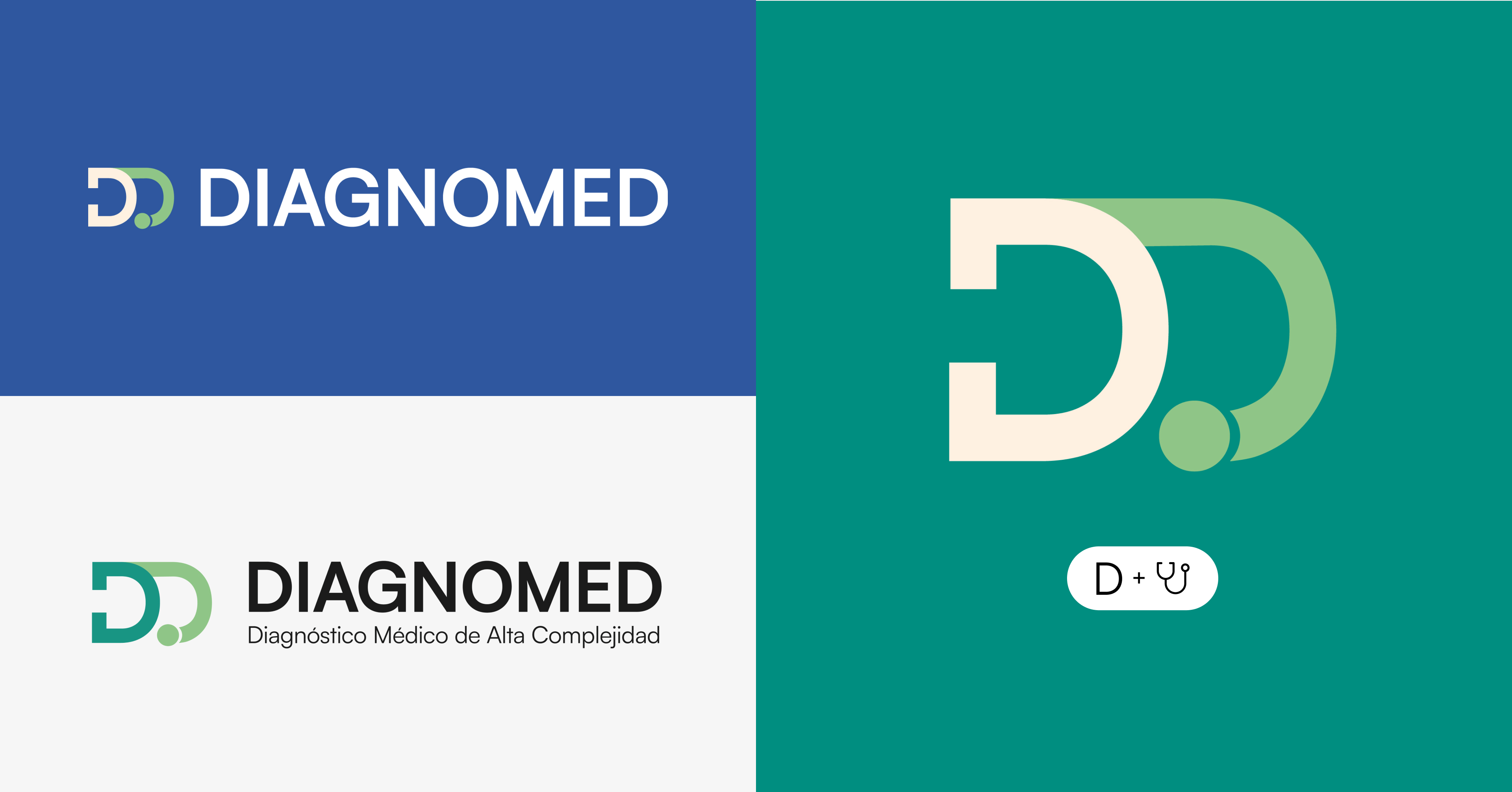
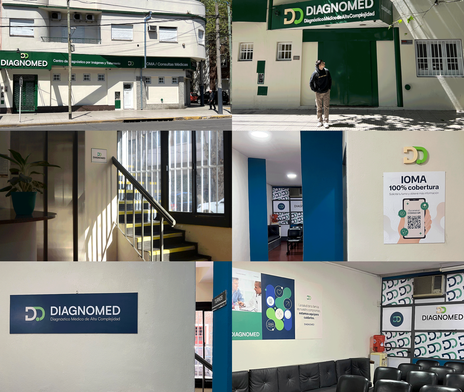
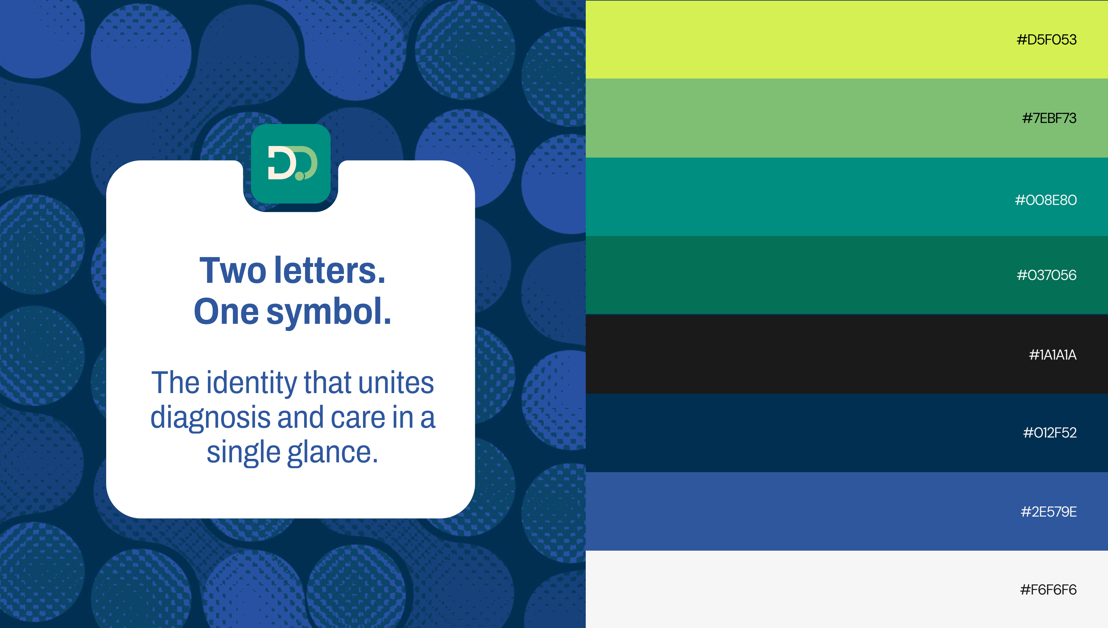
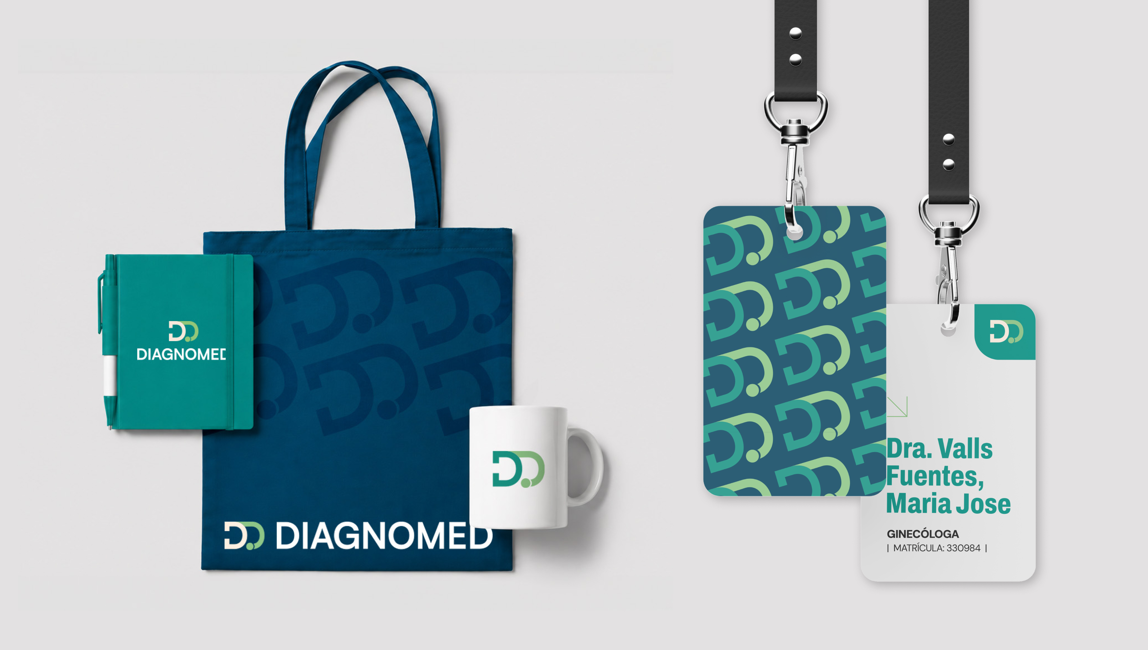
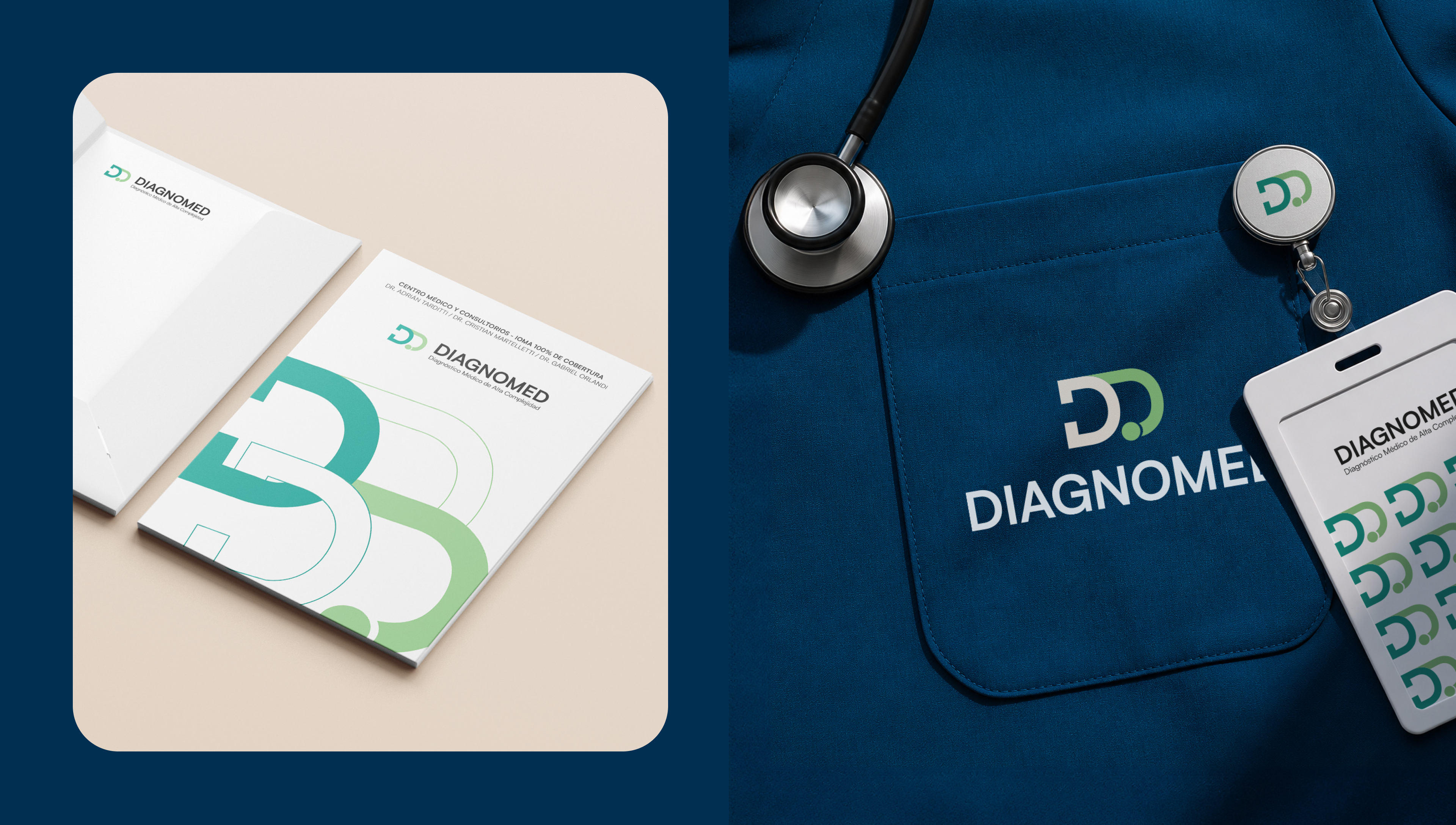
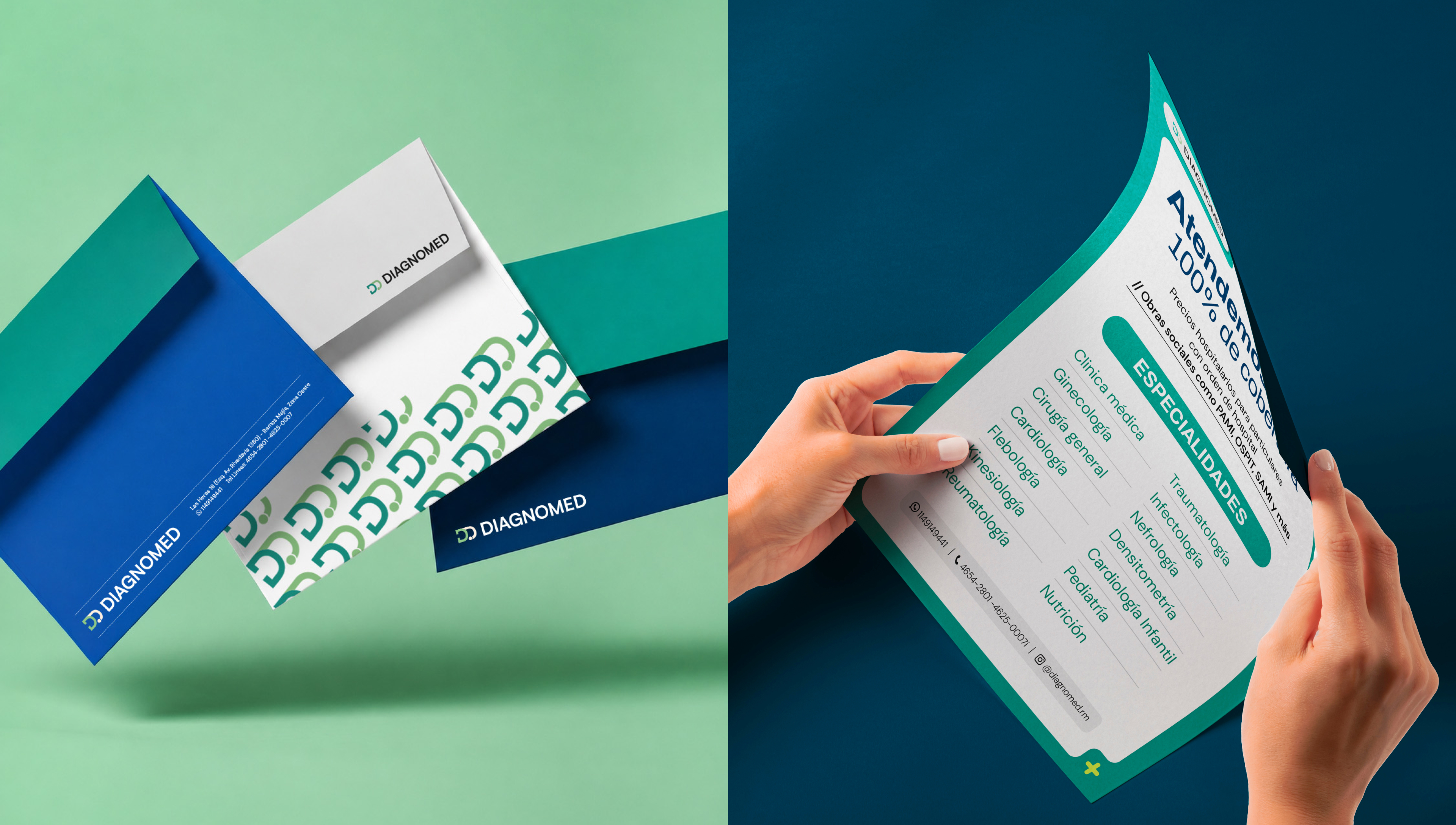
As creative director, I designed and led Diagnomed's complete identity system, also taking on the role of brand communicator and content creator. Every visual decision responded to the need to hold present and future within a single system. The result is a flexible, coherent identity built to scale.
Brand Identity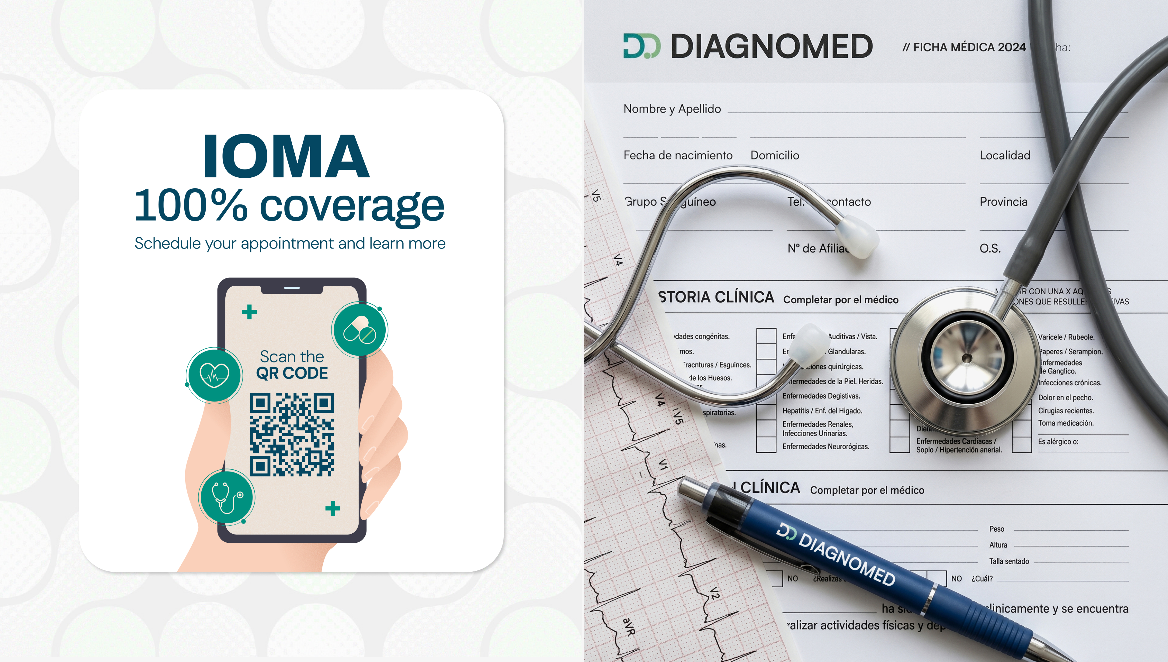


A creative athlete designing identities
with direction
It all starts
with training.
BRANDS THAT
LOVE A CHALLENGE.
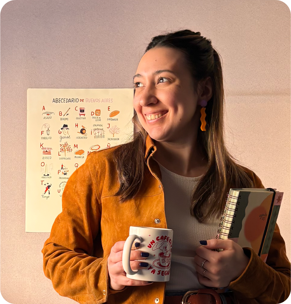
I'm Eugenia Orlandi, I grew up on roller skates and sport shaped the way I create: discipline, dedication and focus became my way of working. Because designing, like training, means pushing every detail until you reach the goal.
I combine athletic discipline with creativity to create distinctive brands with unique styles, striving for organized, strategic, yet sensitive processes.
That's why I created this space for those who dare to express themselves and trust in design as a way to find their place in the world and showcase their identity.
When an idea steps onto the track, it means it's ready — and worth letting everyone see.
Care to explore my creative track?